Limmud
Design for an educational festival
From: Client
We need to rebrand ourselves, as the same group of people attends the festival every year. While maintaining some familiarity for them, we need to break out of this pattern and attract a new, younger audience. Additionally, we face the challenge of clearly conveying who we are, as the festival offers a diverse range of learning, entertainment, and networking opportunities— but people often perceive us as just a series of lectures.
Project Info
YEar
2022-2023
what did i do?
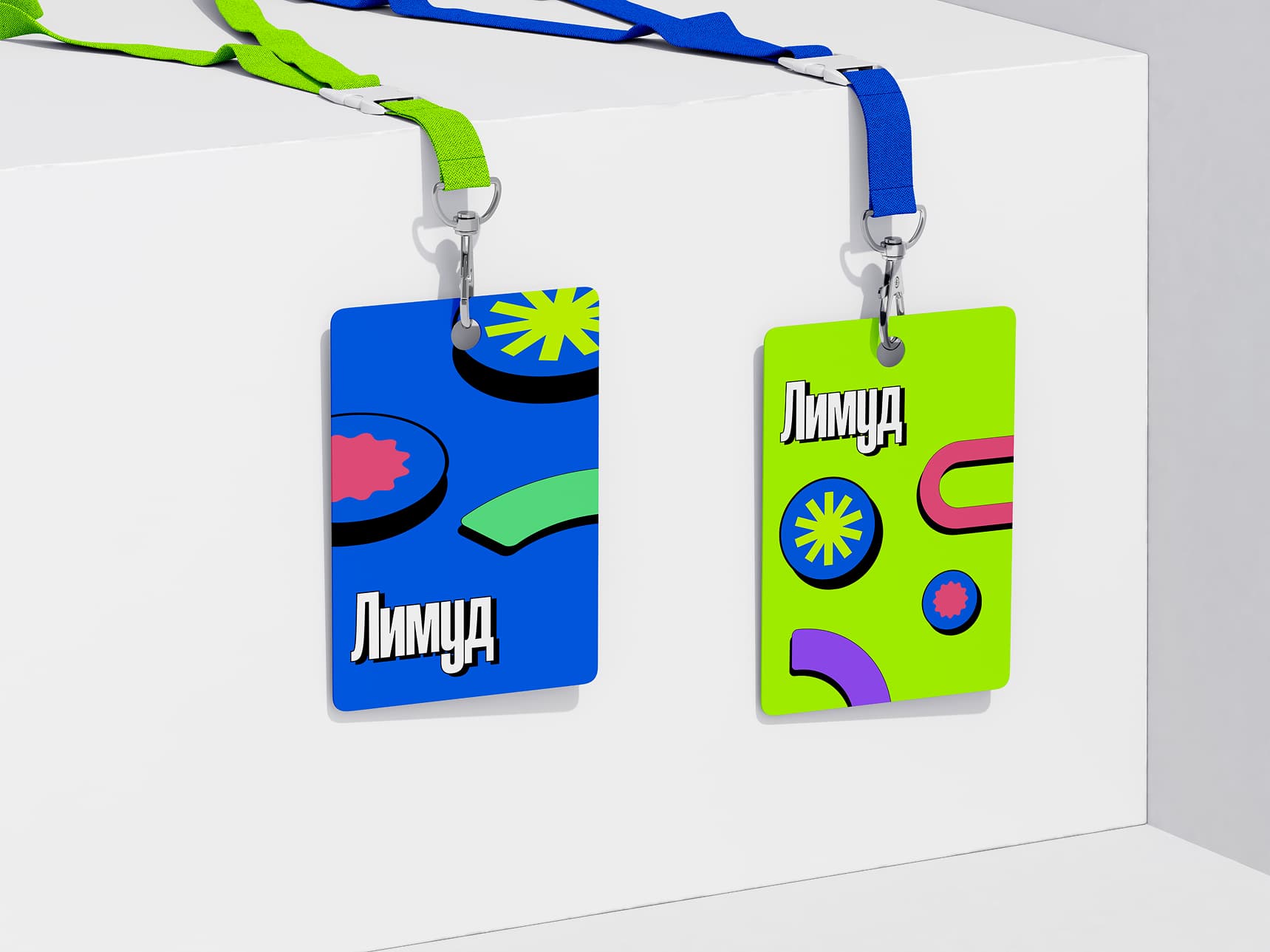
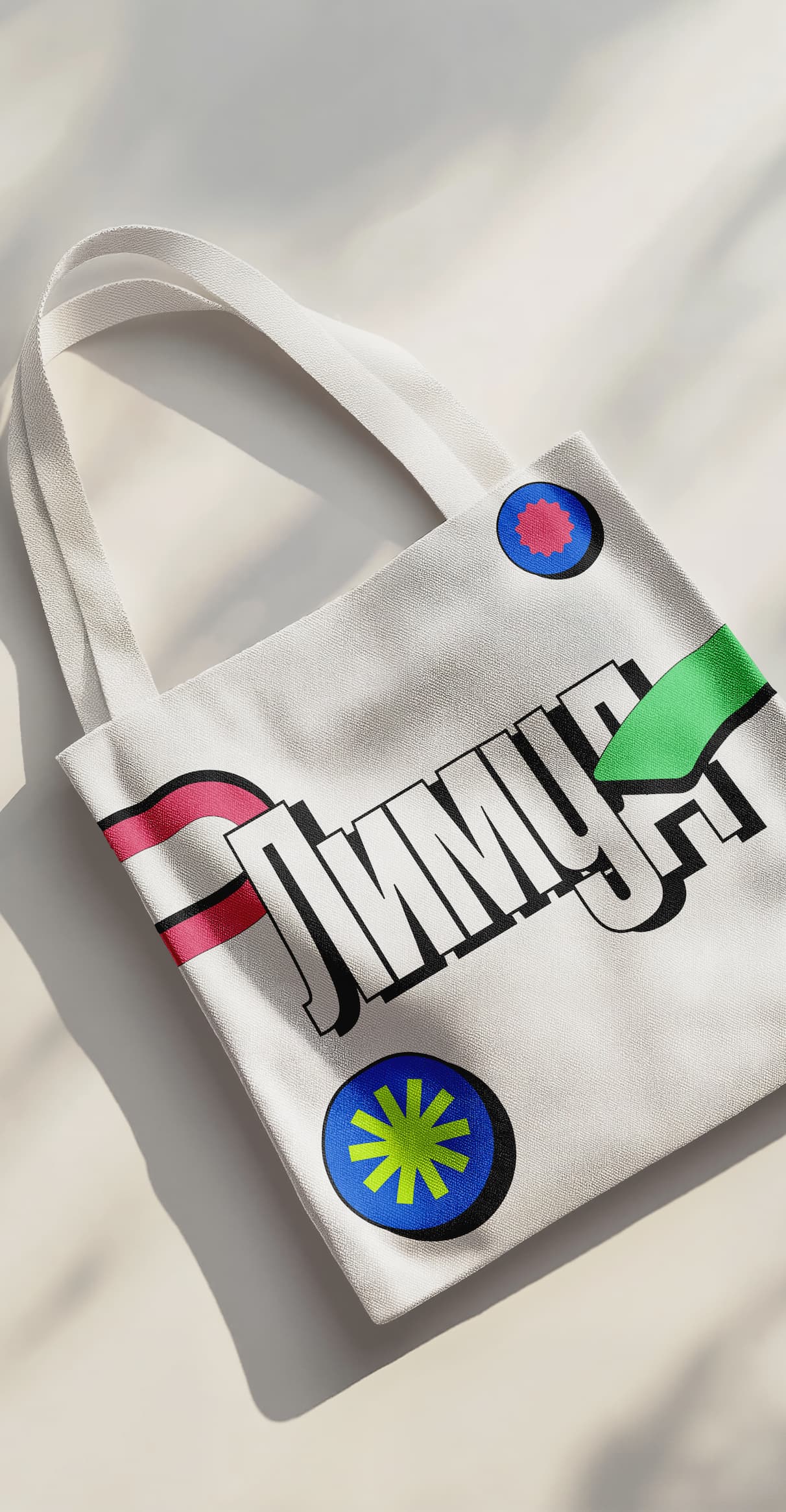
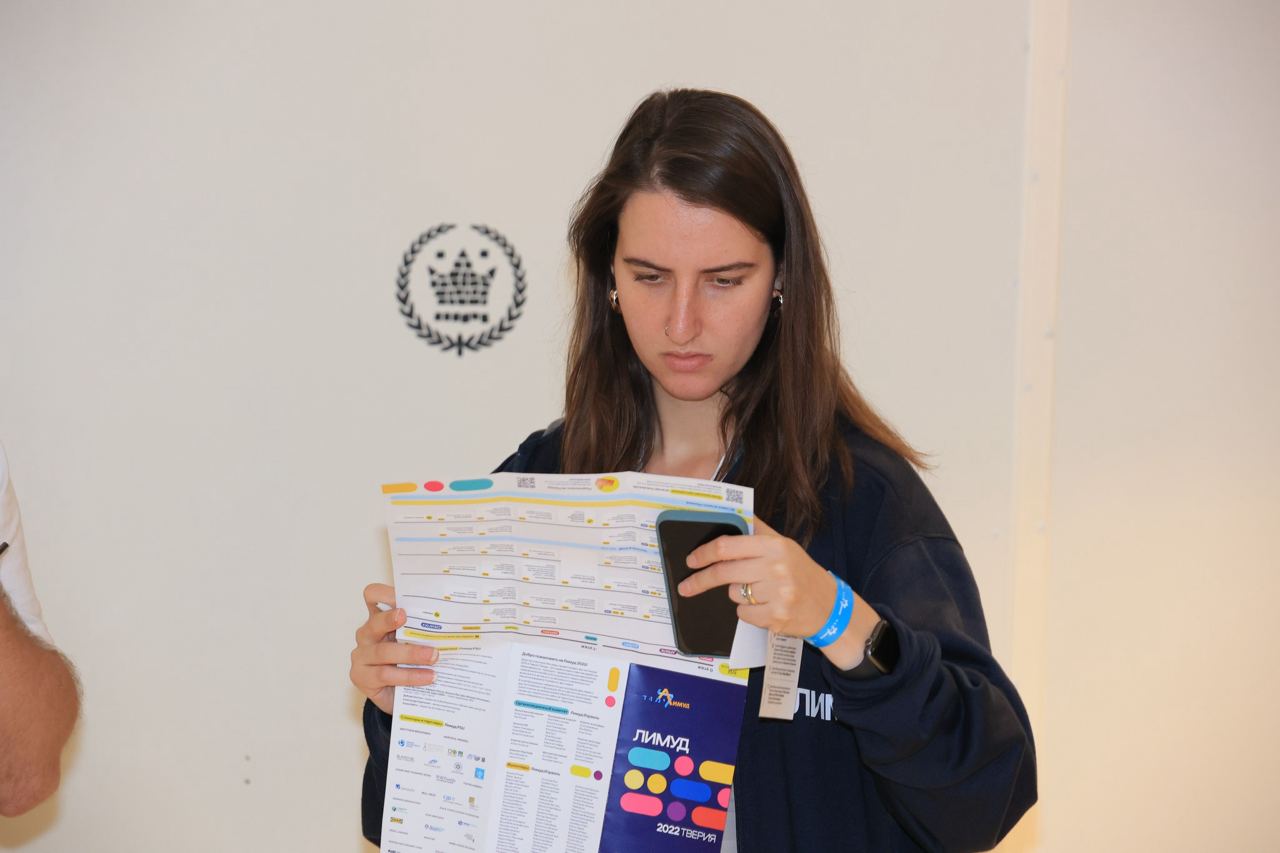
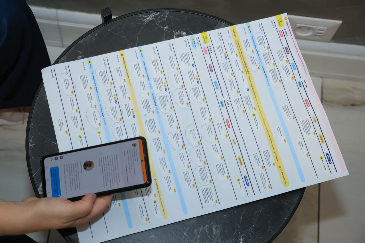
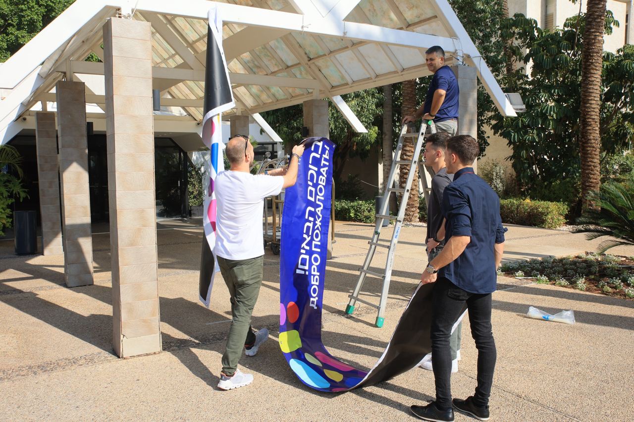
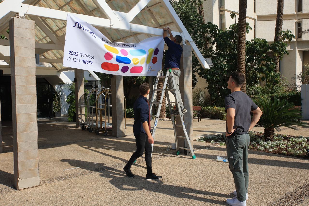
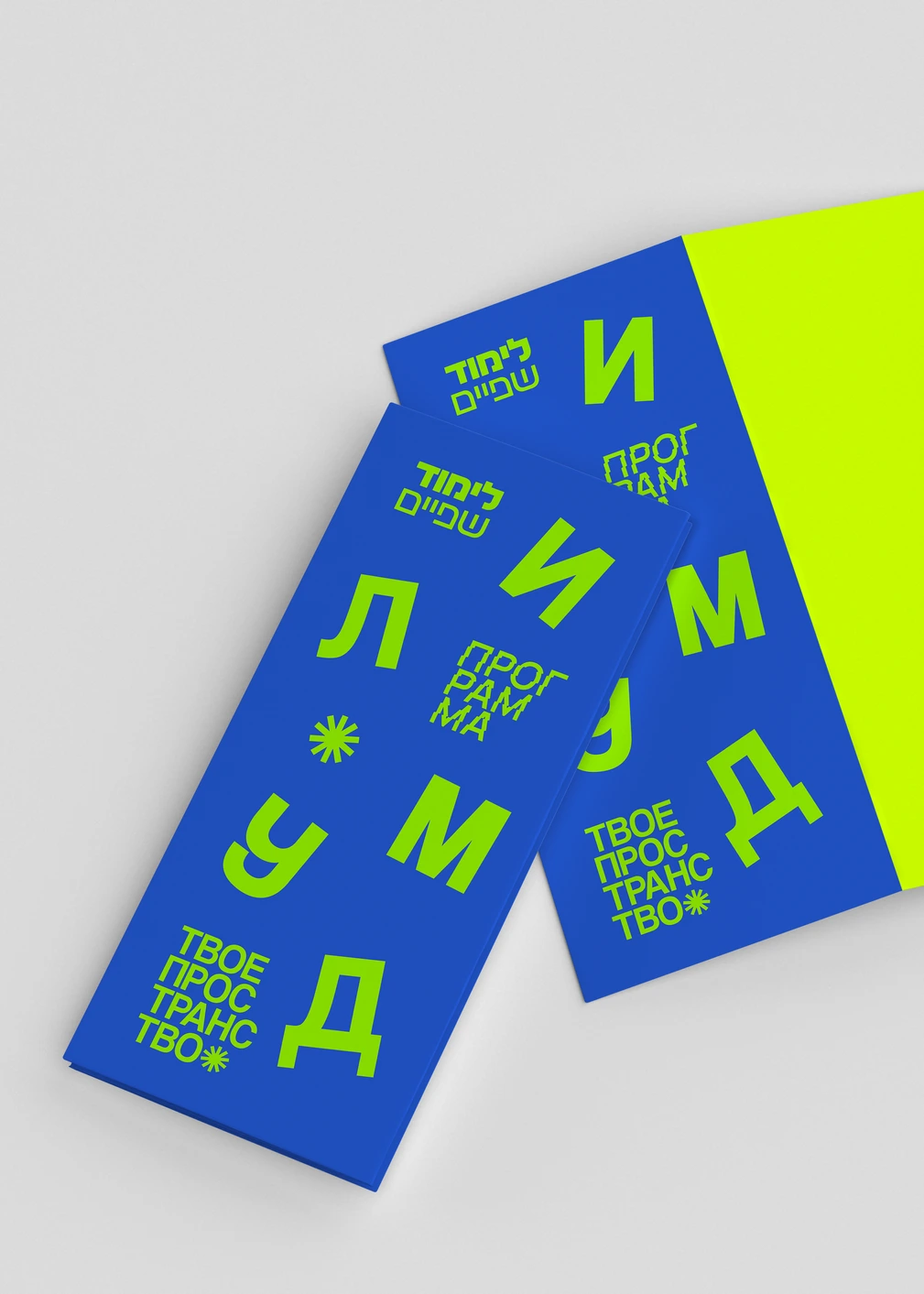
Brand audit, identity & design system, print production, social media graphics
stack
The Solution
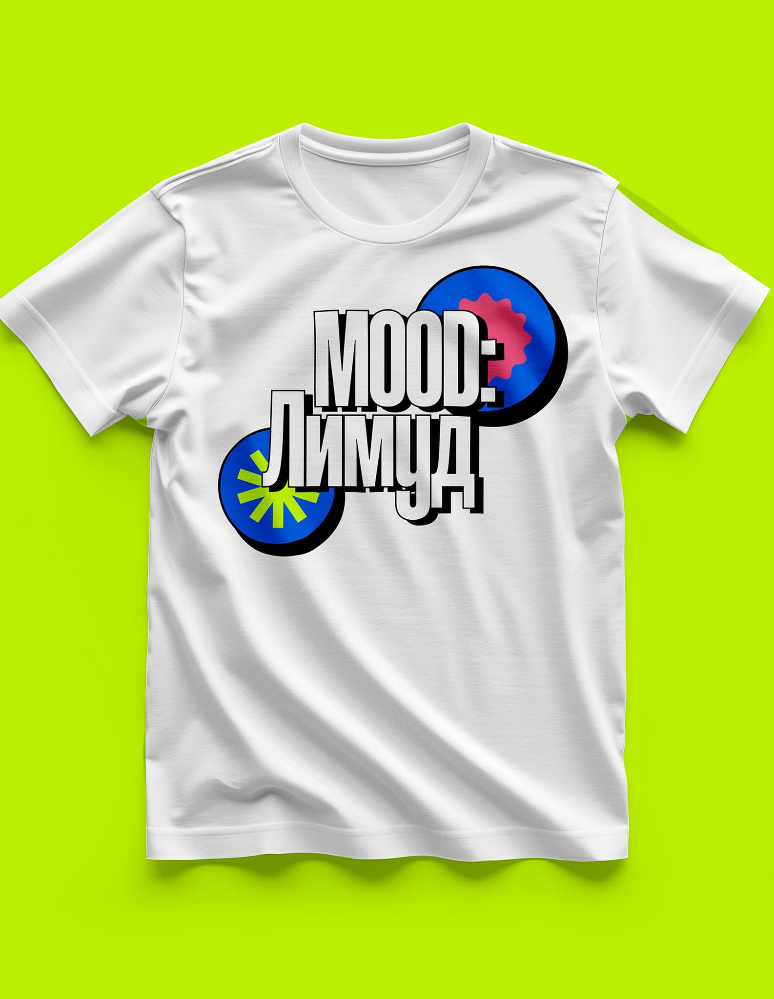
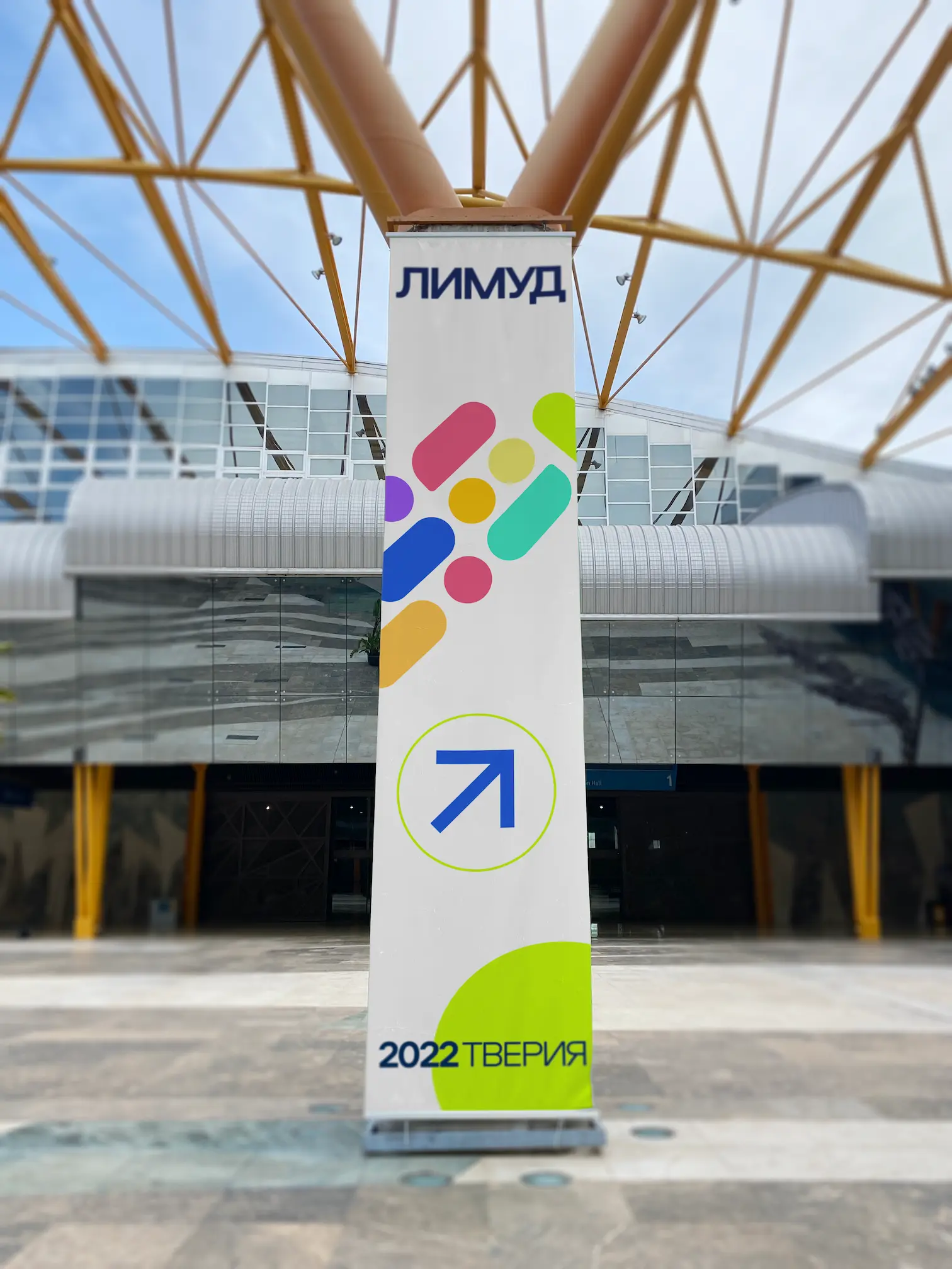
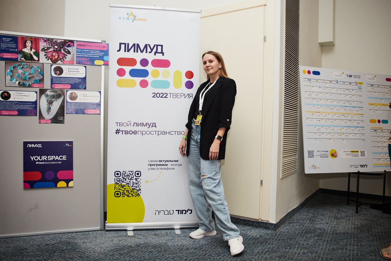
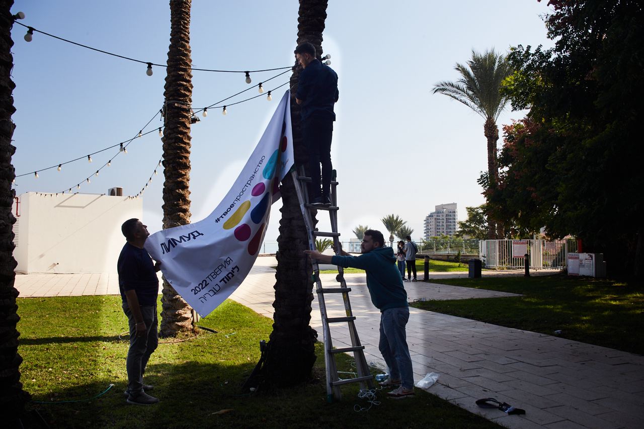
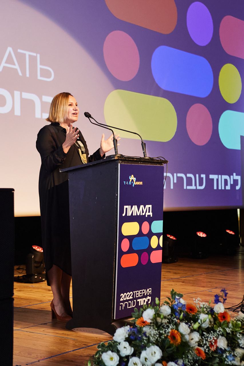
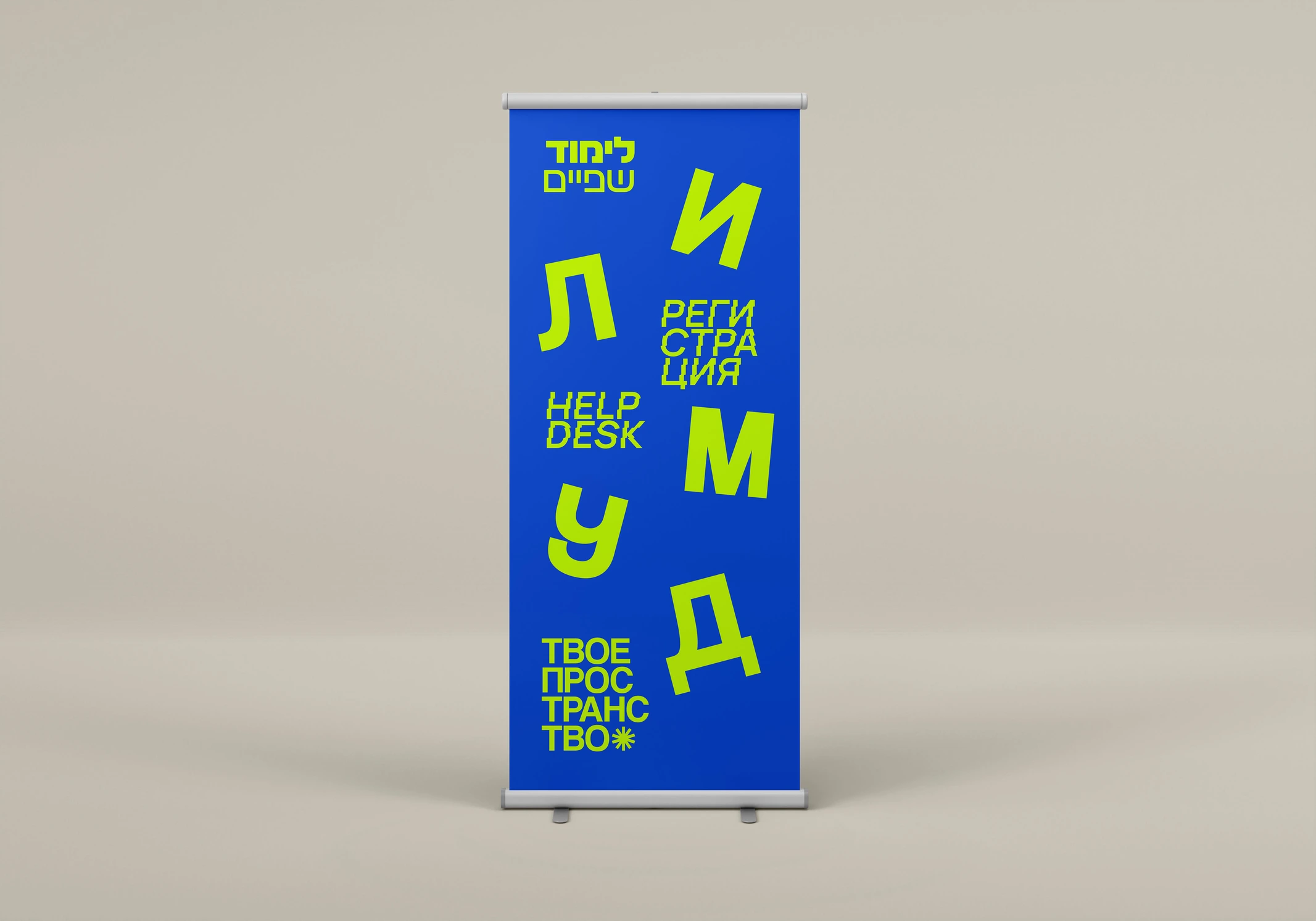
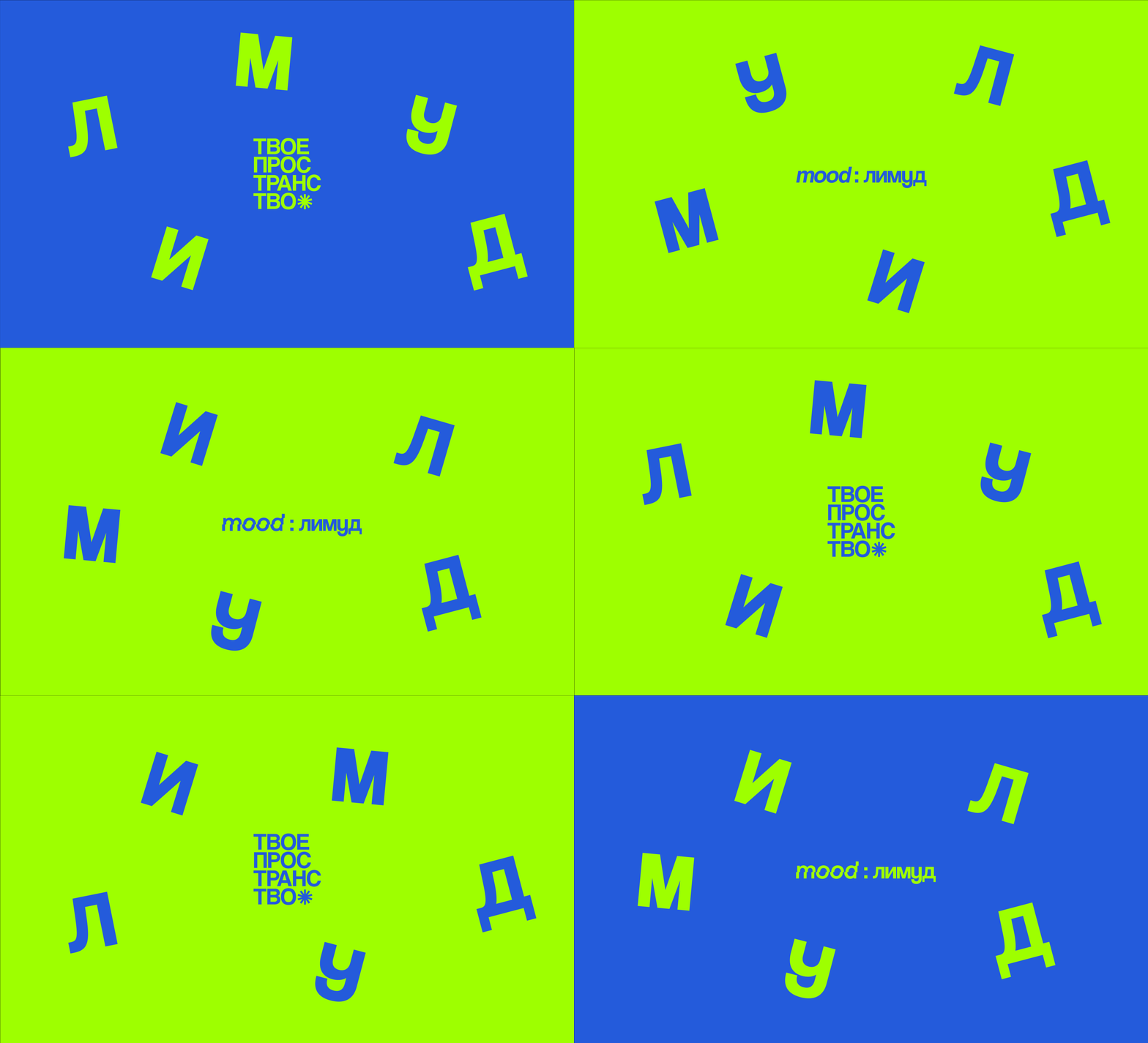
An audit showed that the graphic in previous years was quite moderate and discreet. Additionally, it was only incorporated within the festival itself and was never featured in advertising or social campaigns leading up to the event. To attract new attention to the project, I developed a fresh, bold, playful, and simplified design that communicates several key feelings: vibrancy, creativity, diversity and lightness.
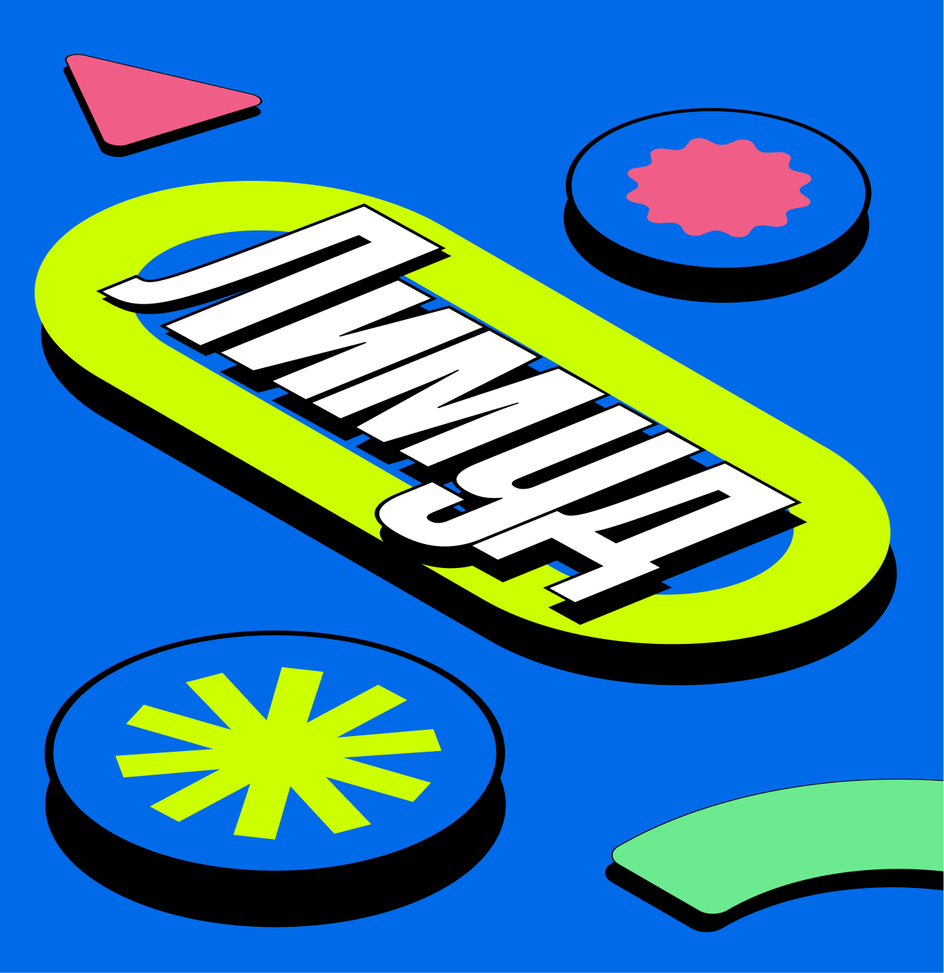
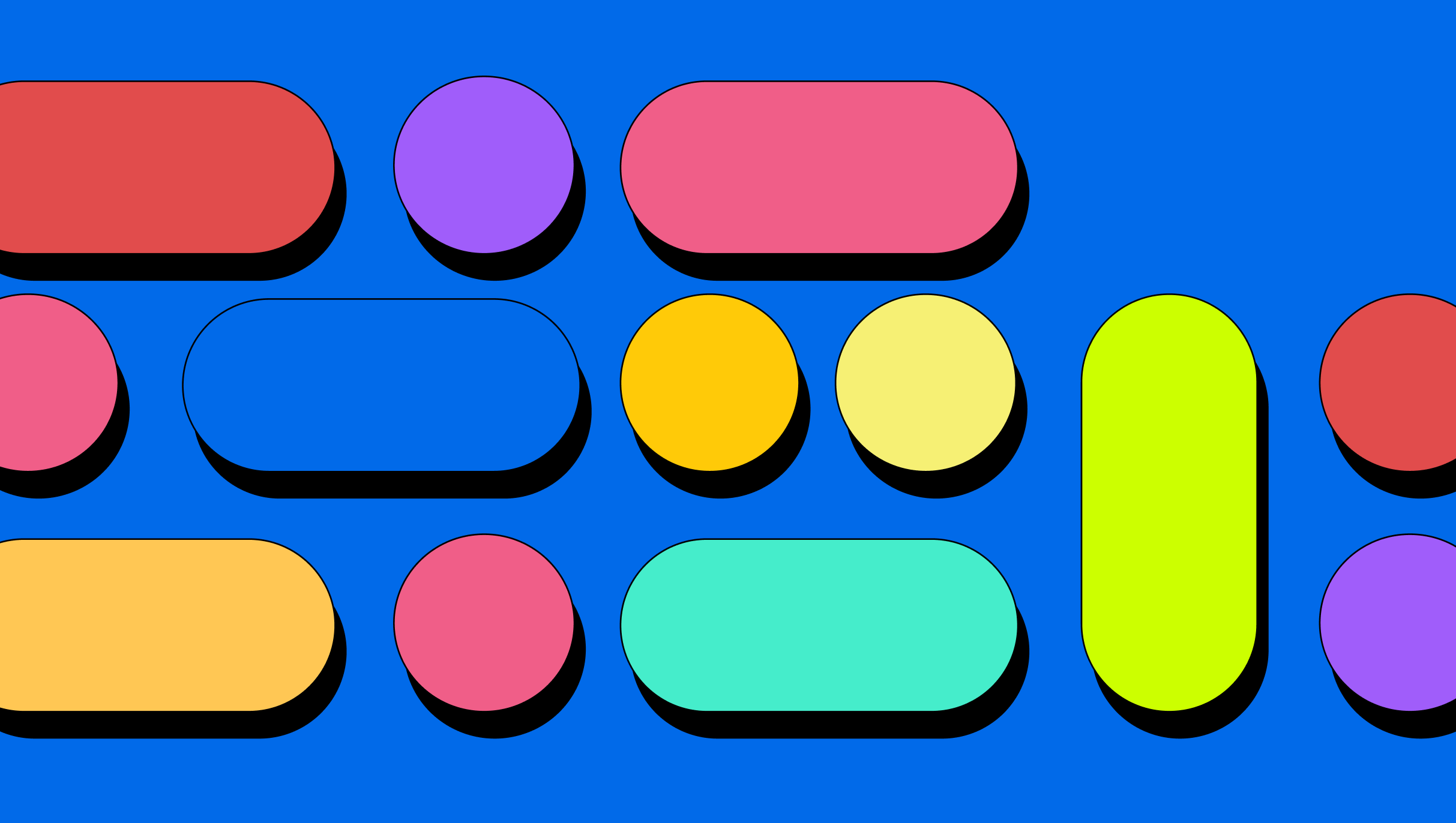
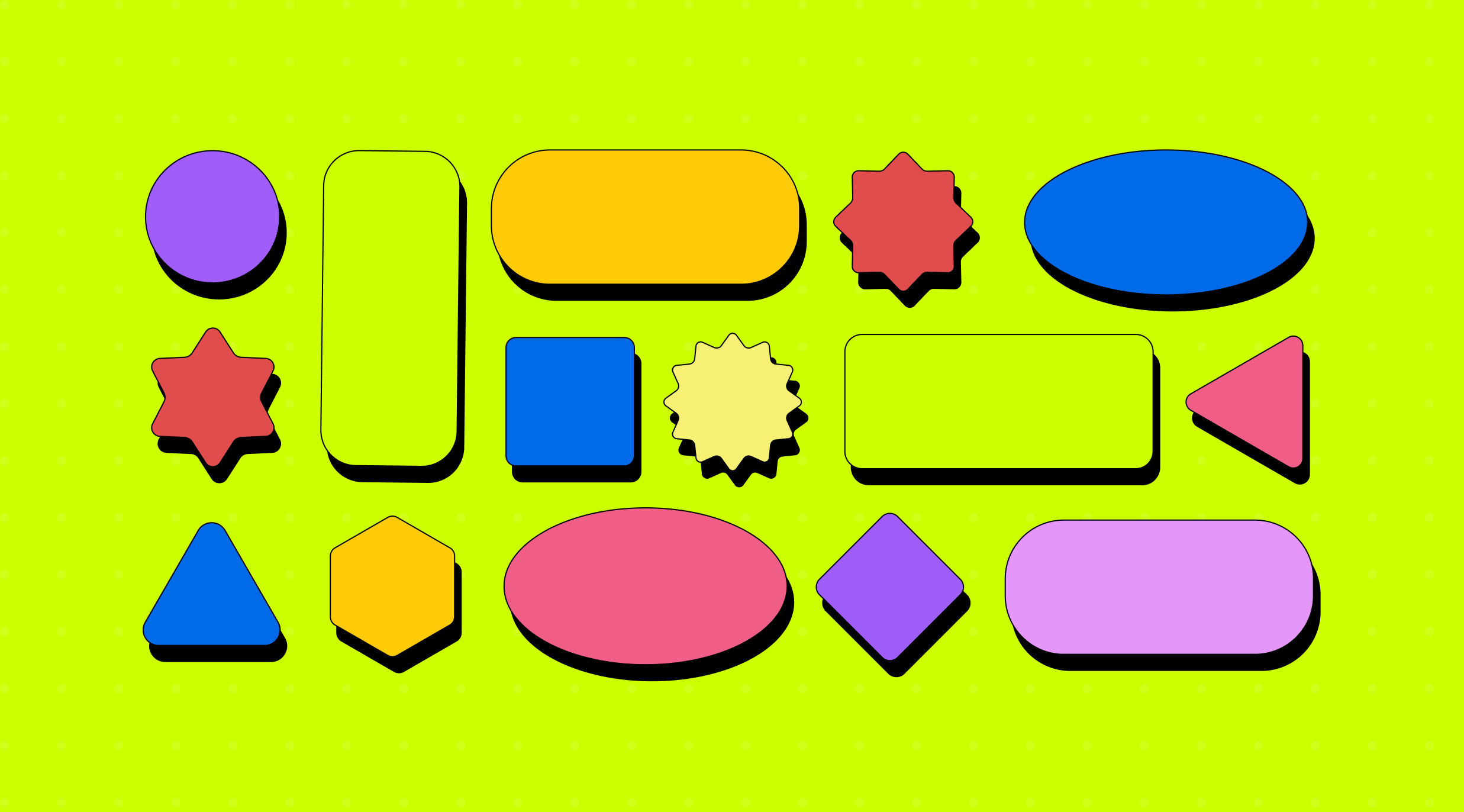
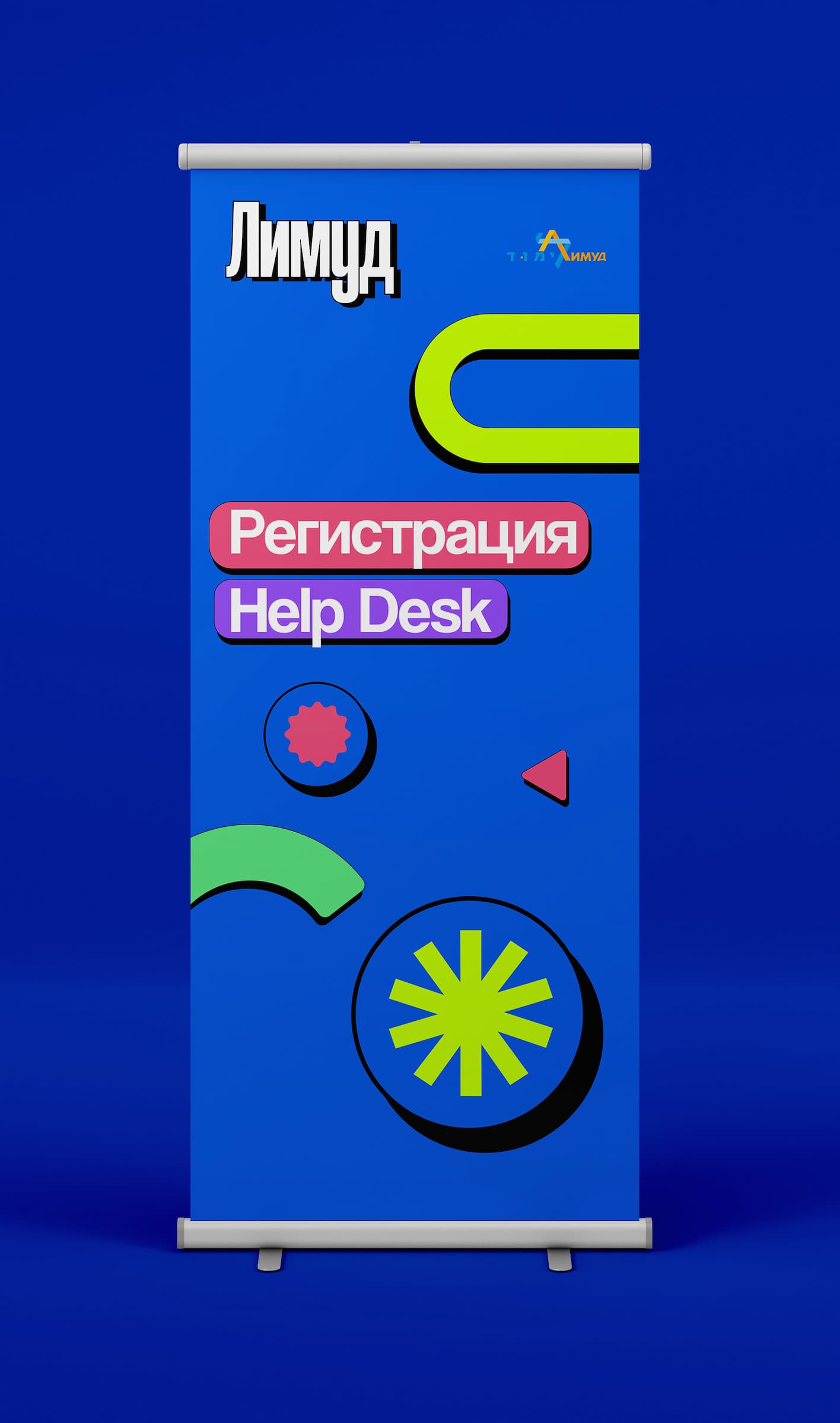
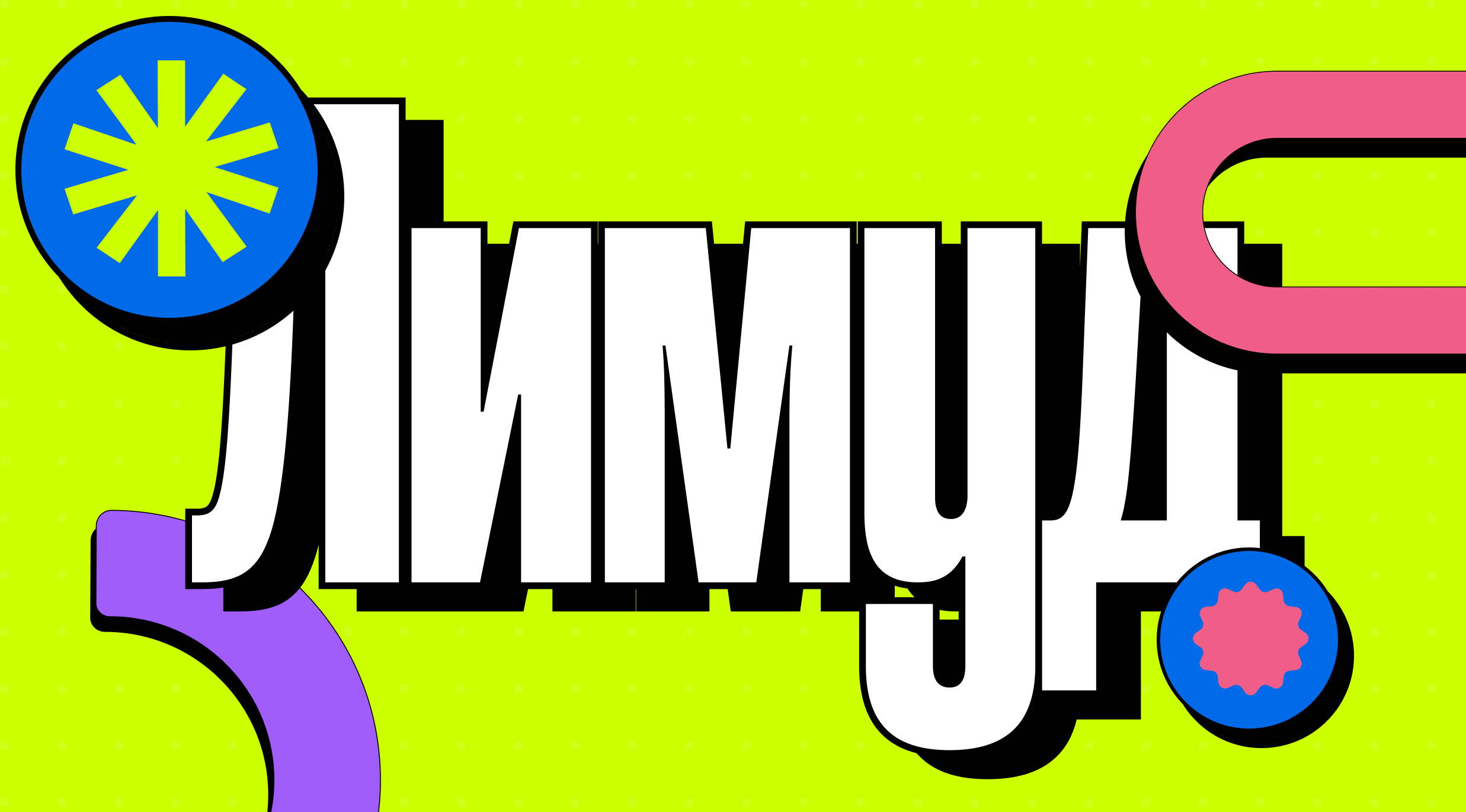
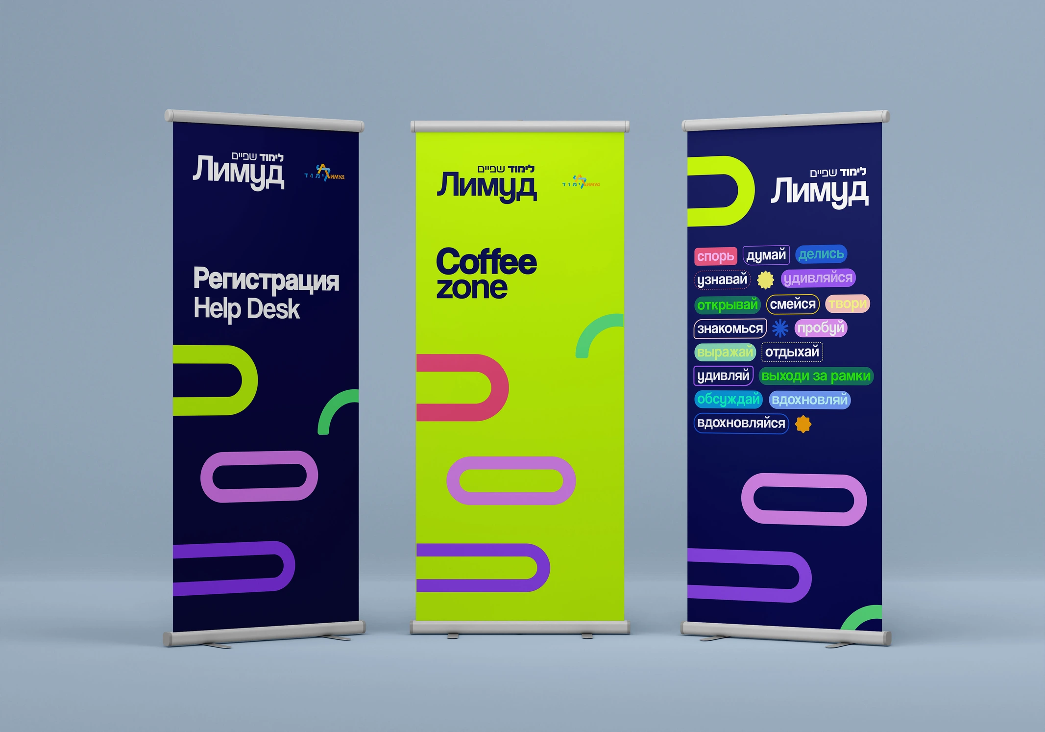
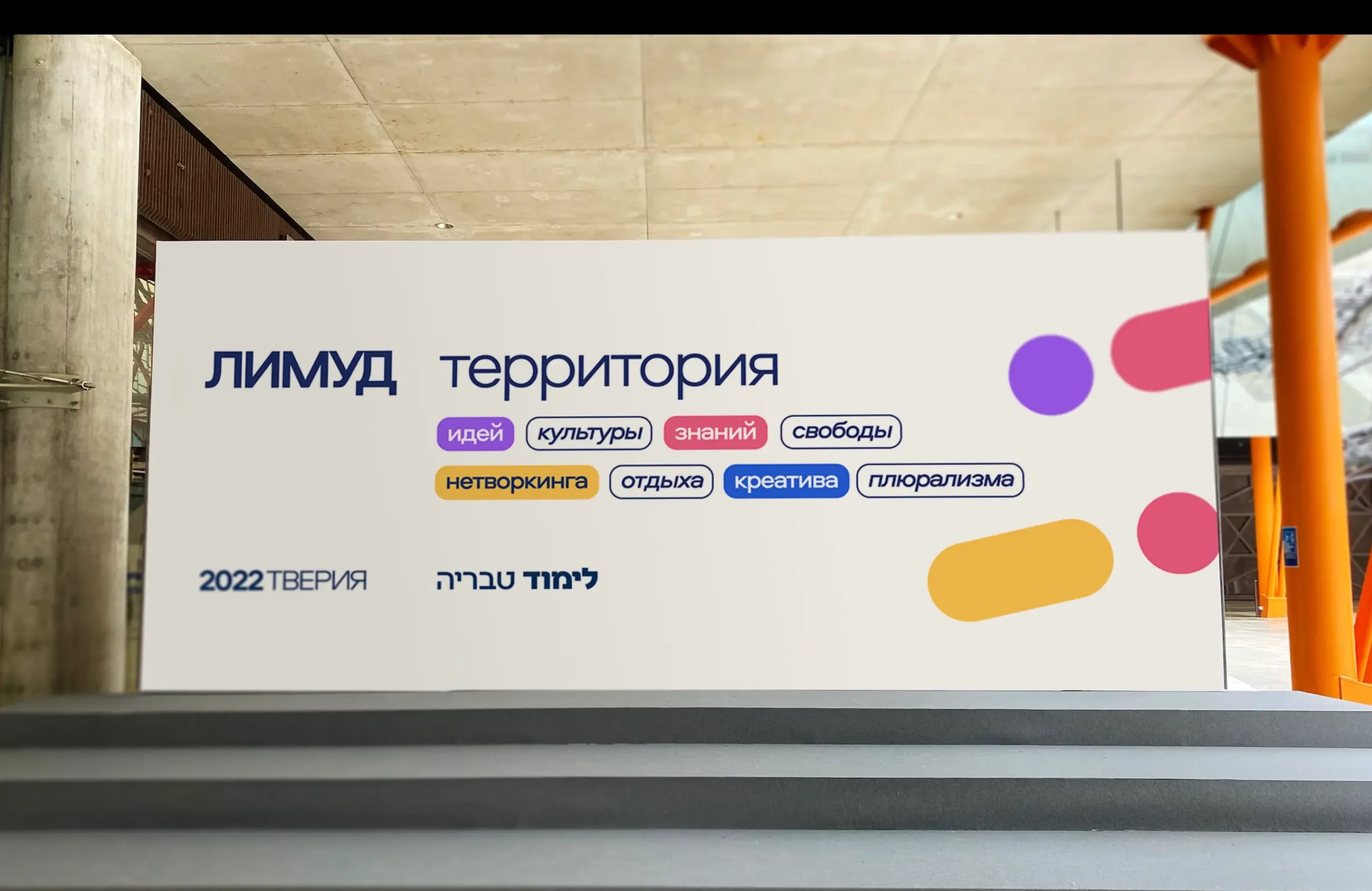
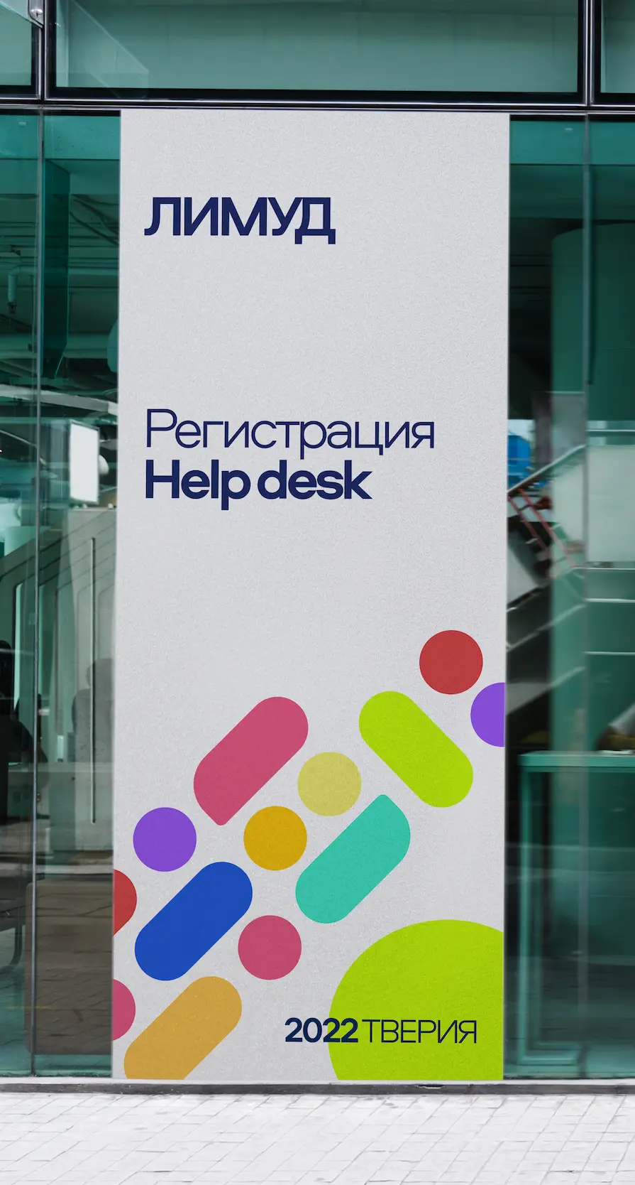
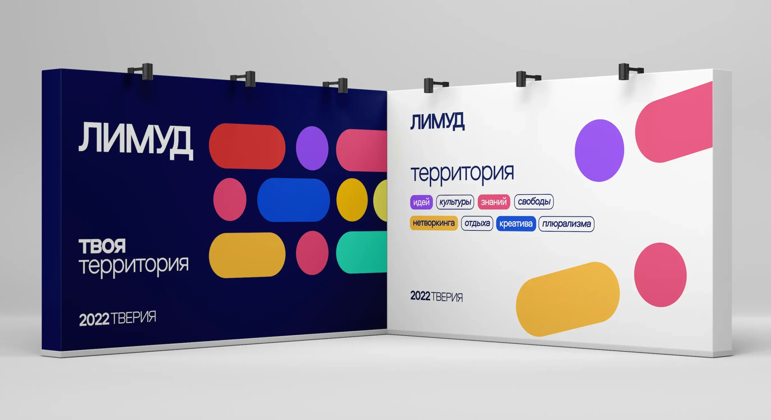
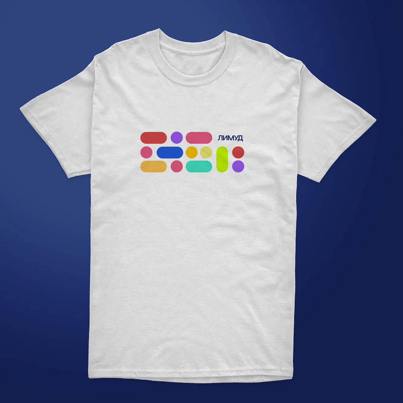
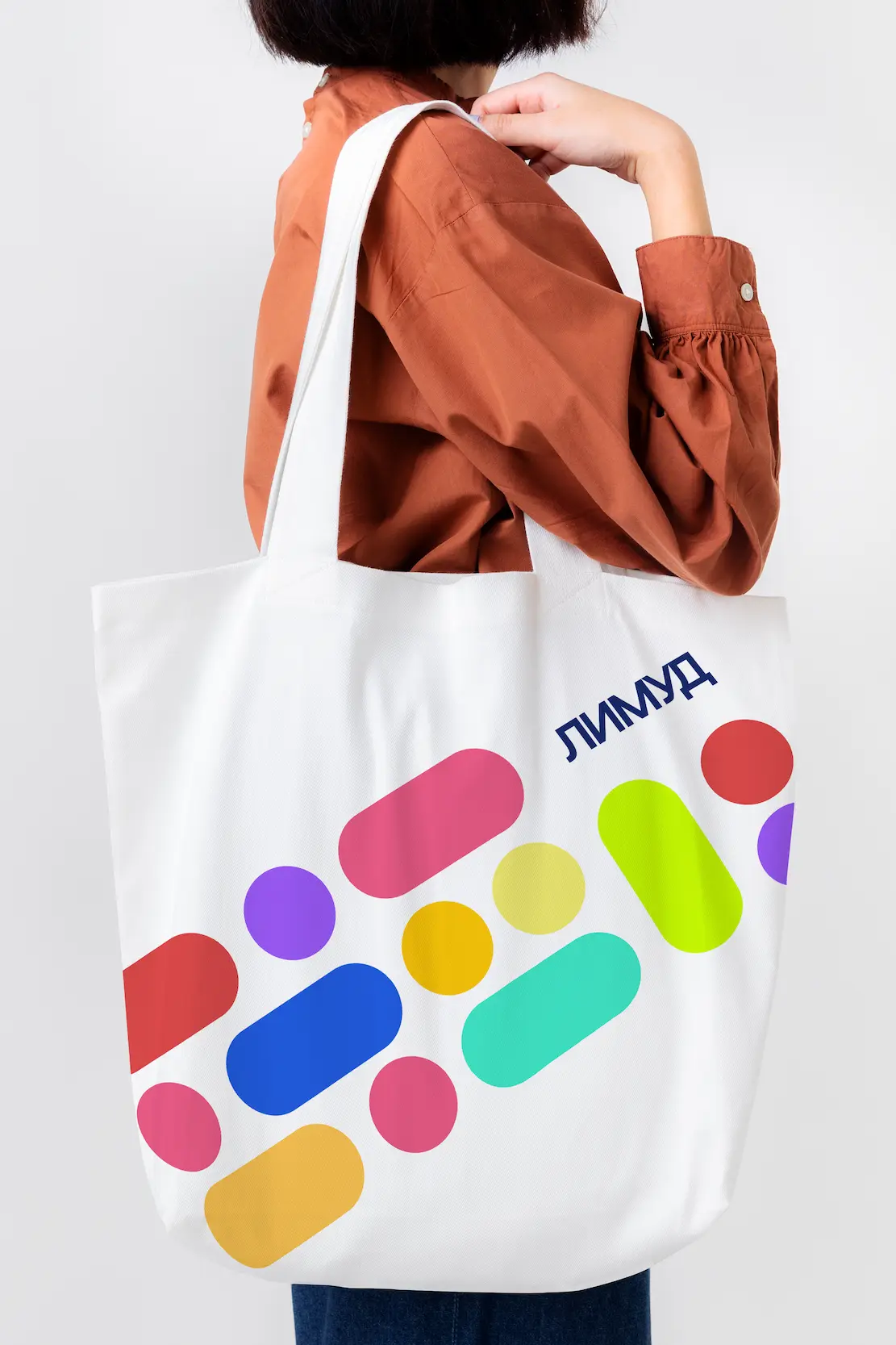
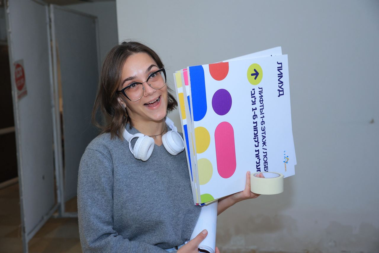
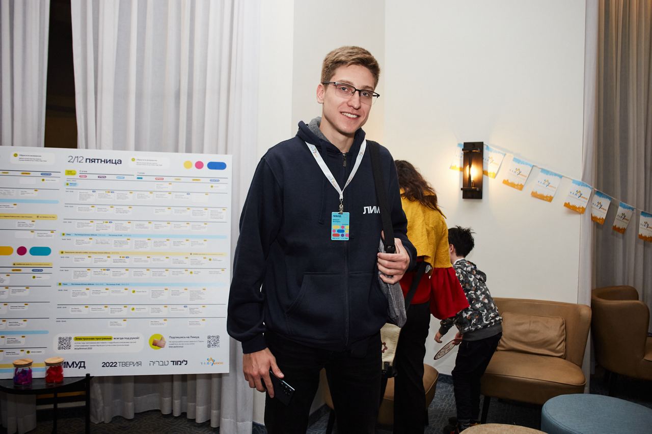
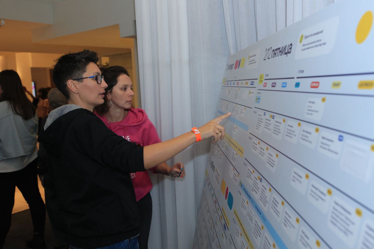
At the heart of this concept are colors and shapes that reflect the diverse array of events within the festival.
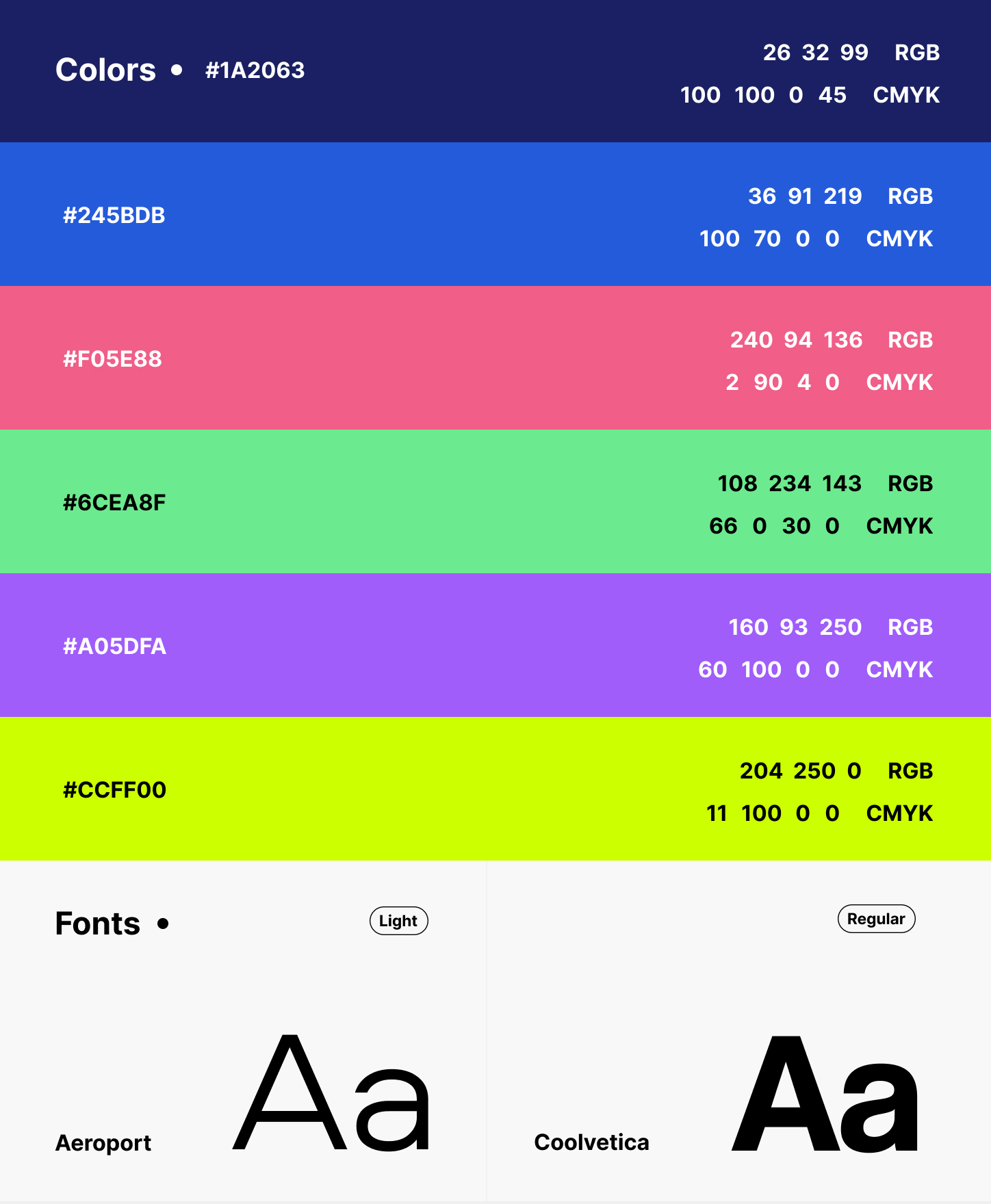
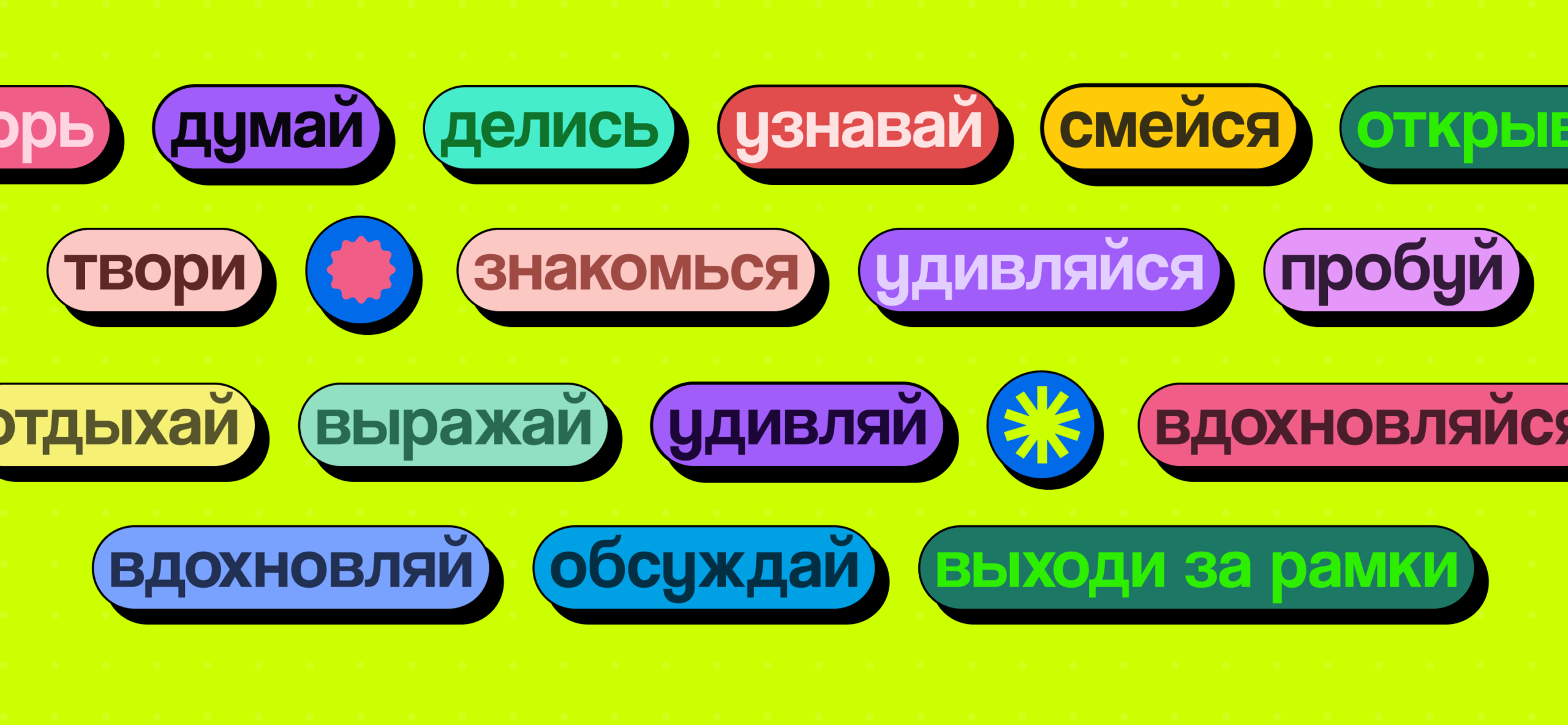
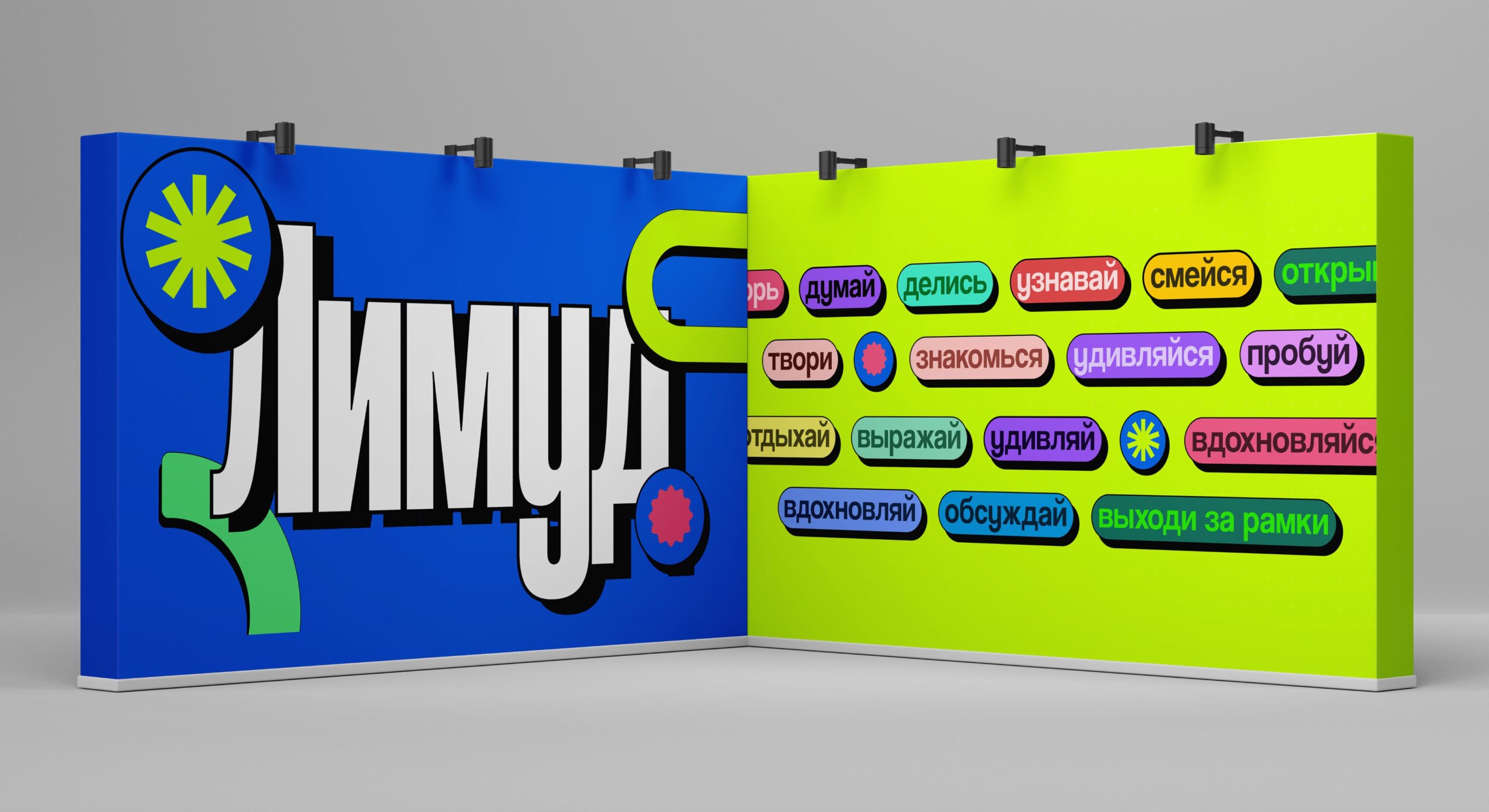
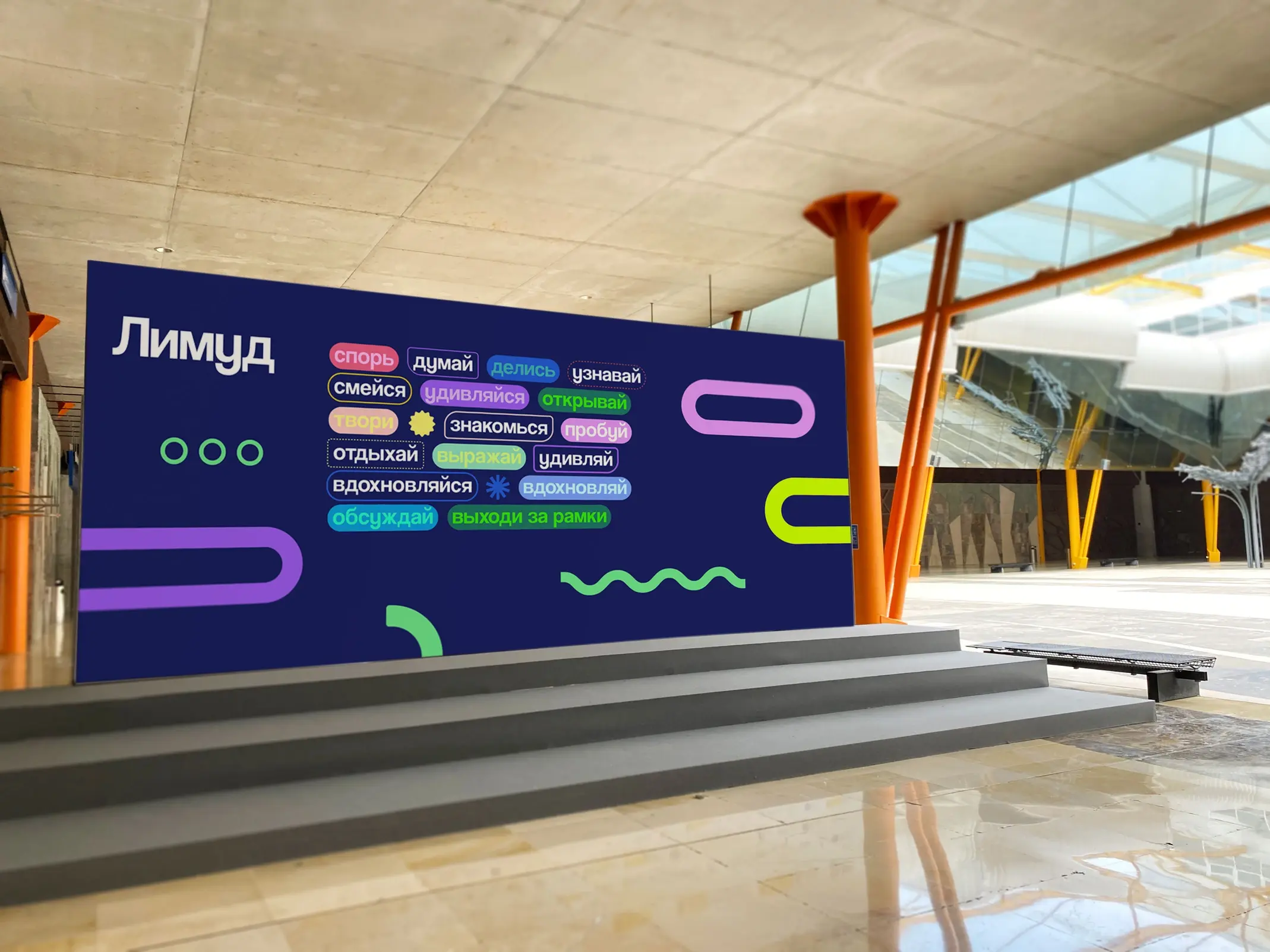
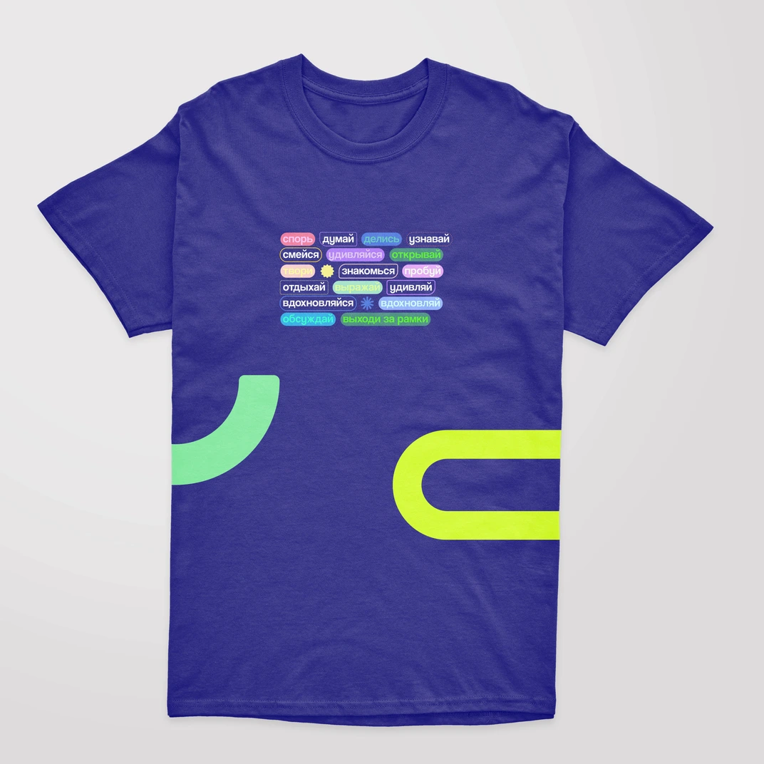
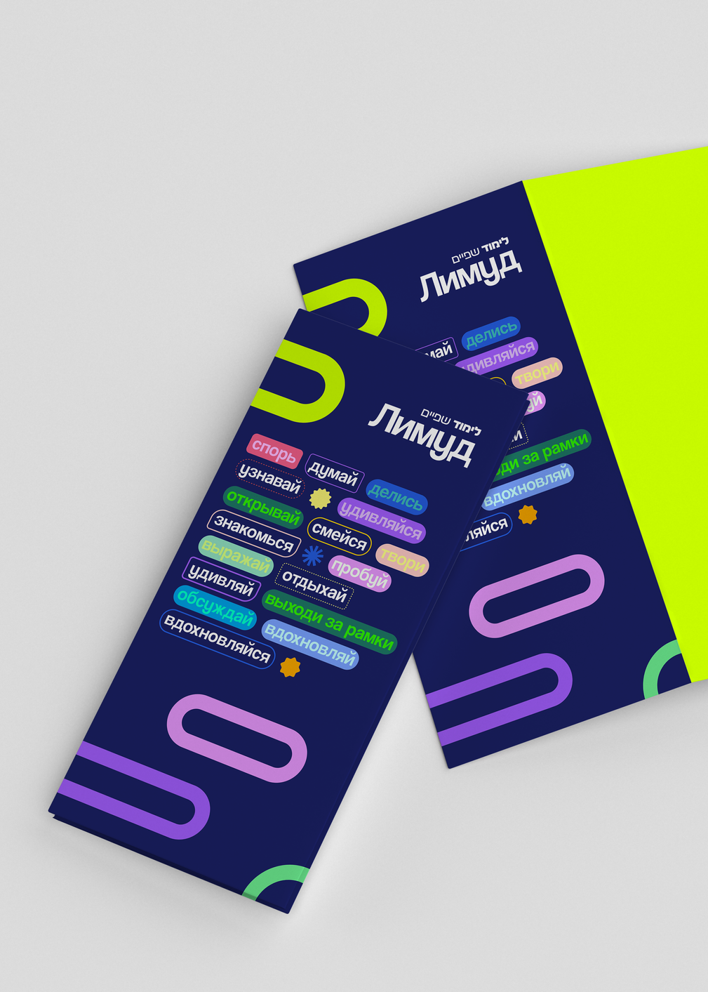
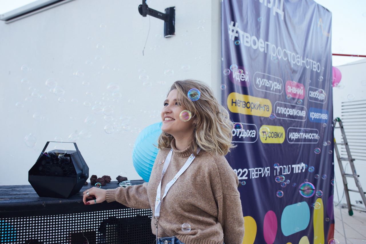
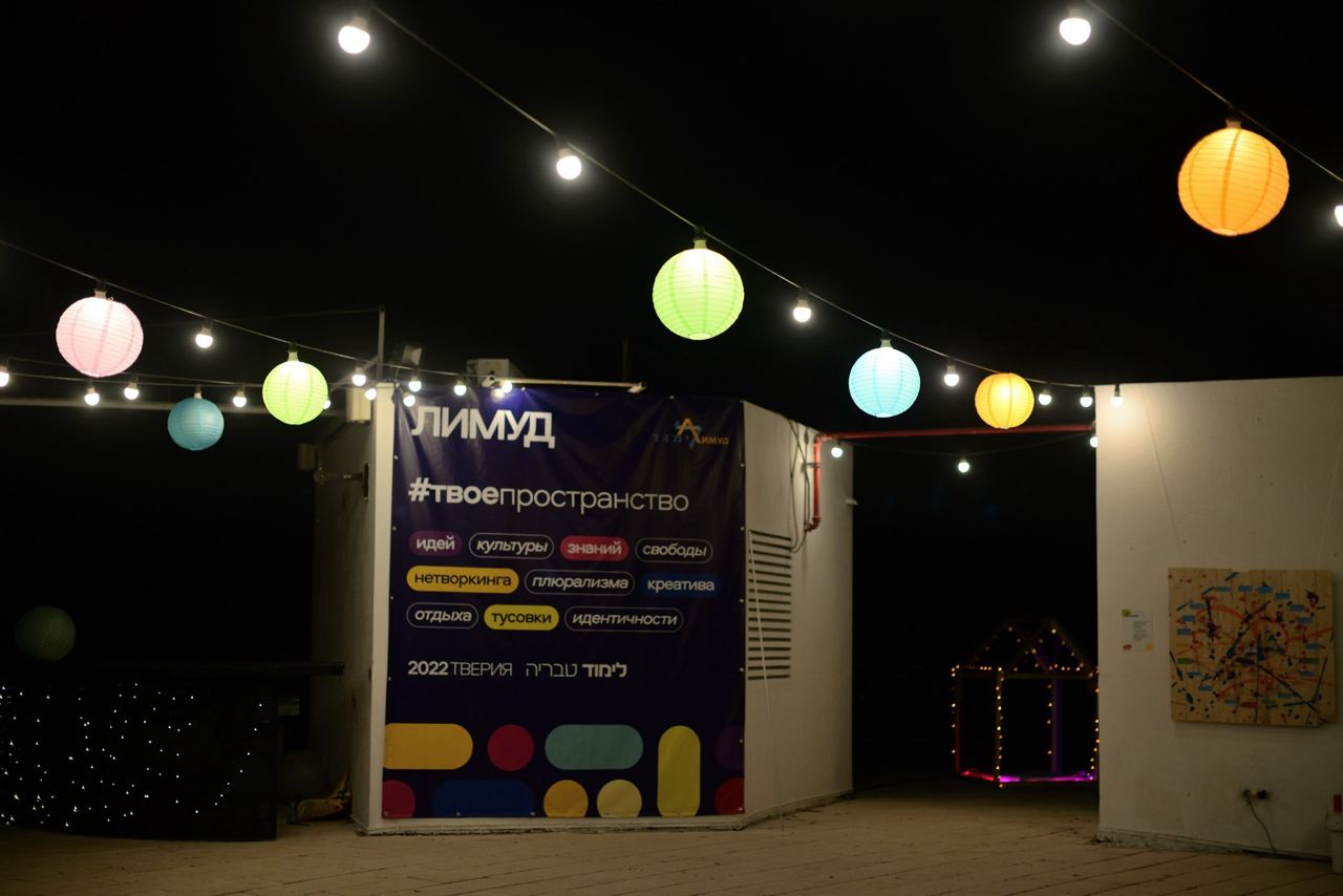
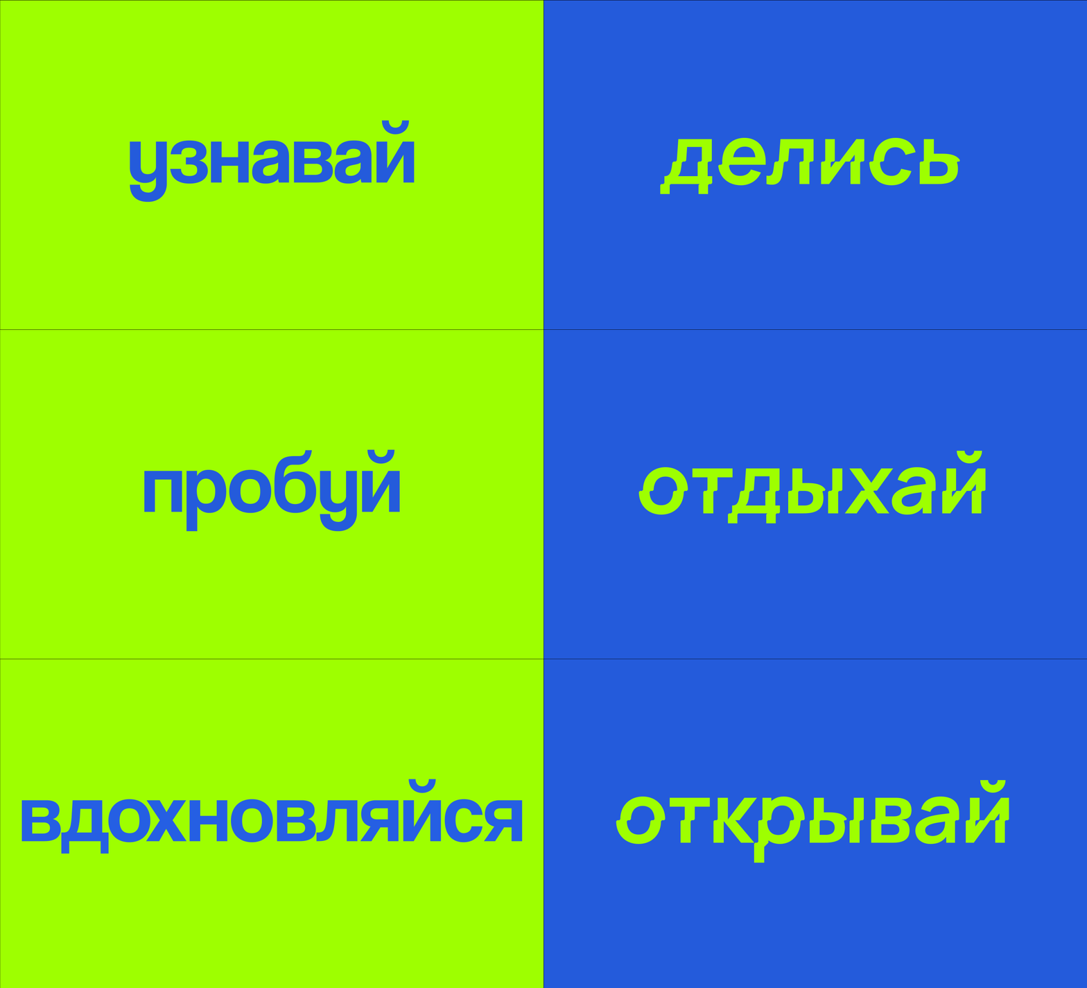
Additionally, we communicate directly all kinds of activities that participants can engage in during the event.
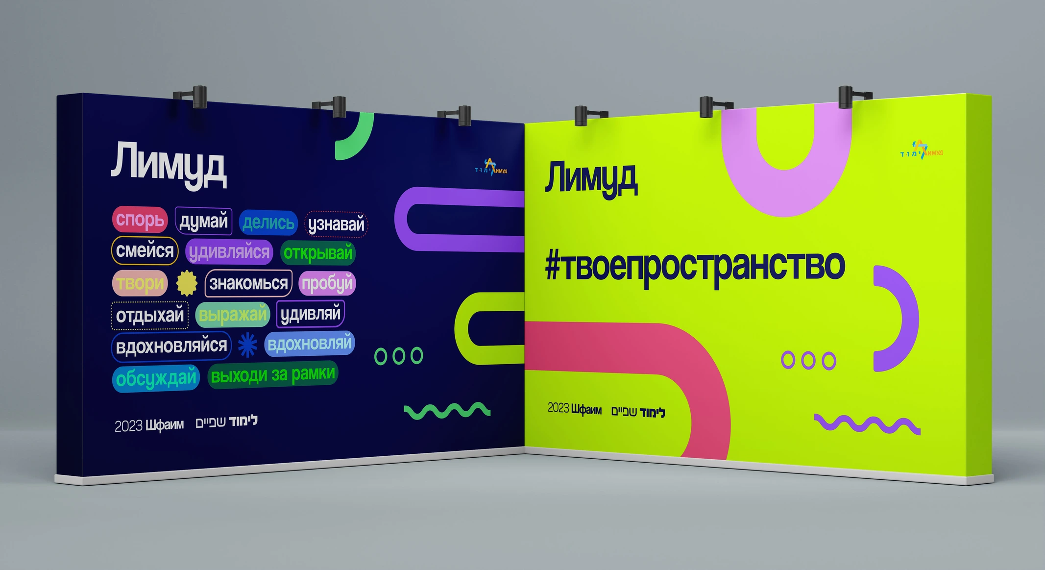
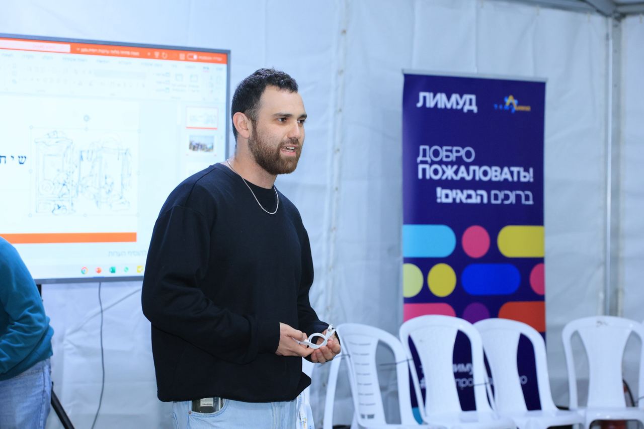
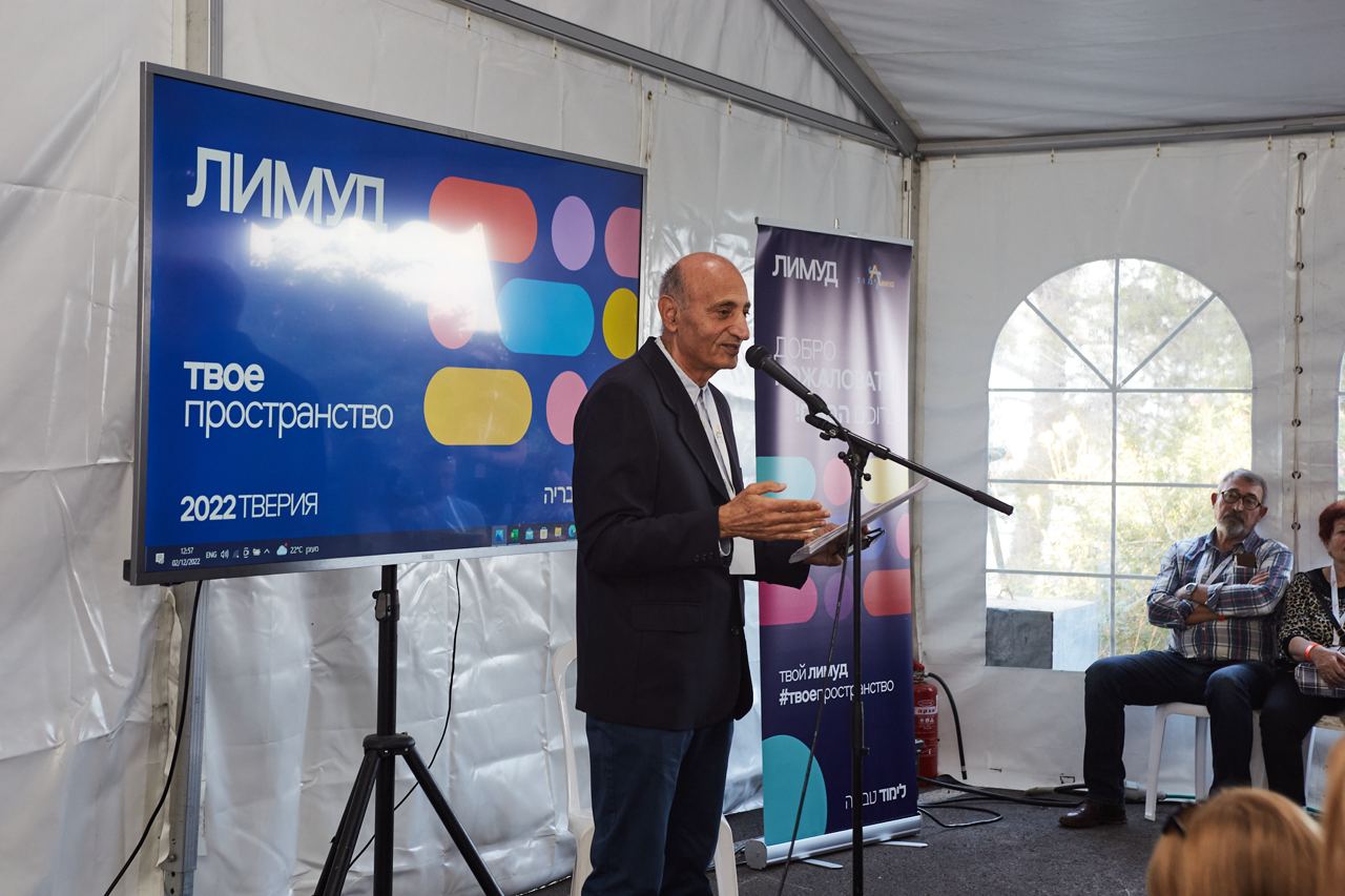
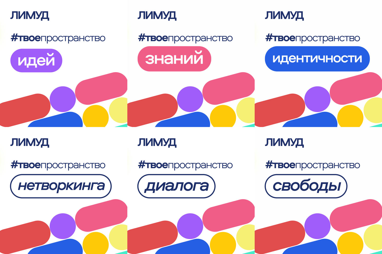
The central tag line is "Your Space," reflecting how Limmud creates a space for ideas, knowledge, culture, creativity, networking etc. It evolves into "Your Limmud. Your Space," suggesting that attendees can tailor their experience by selecting from diverse offerings, making Limmud a unique, personalized, and distinctive journey for everyone.
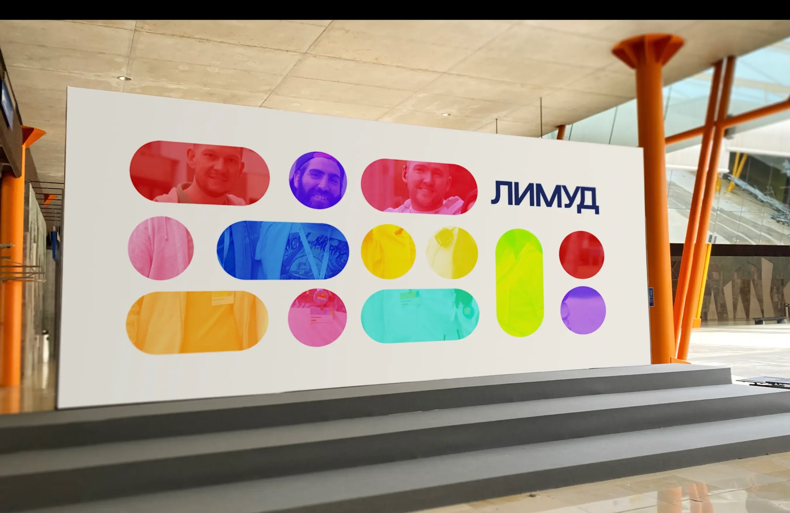
In the graphics, we convey this concept through a kind of constructor with a variety of options.
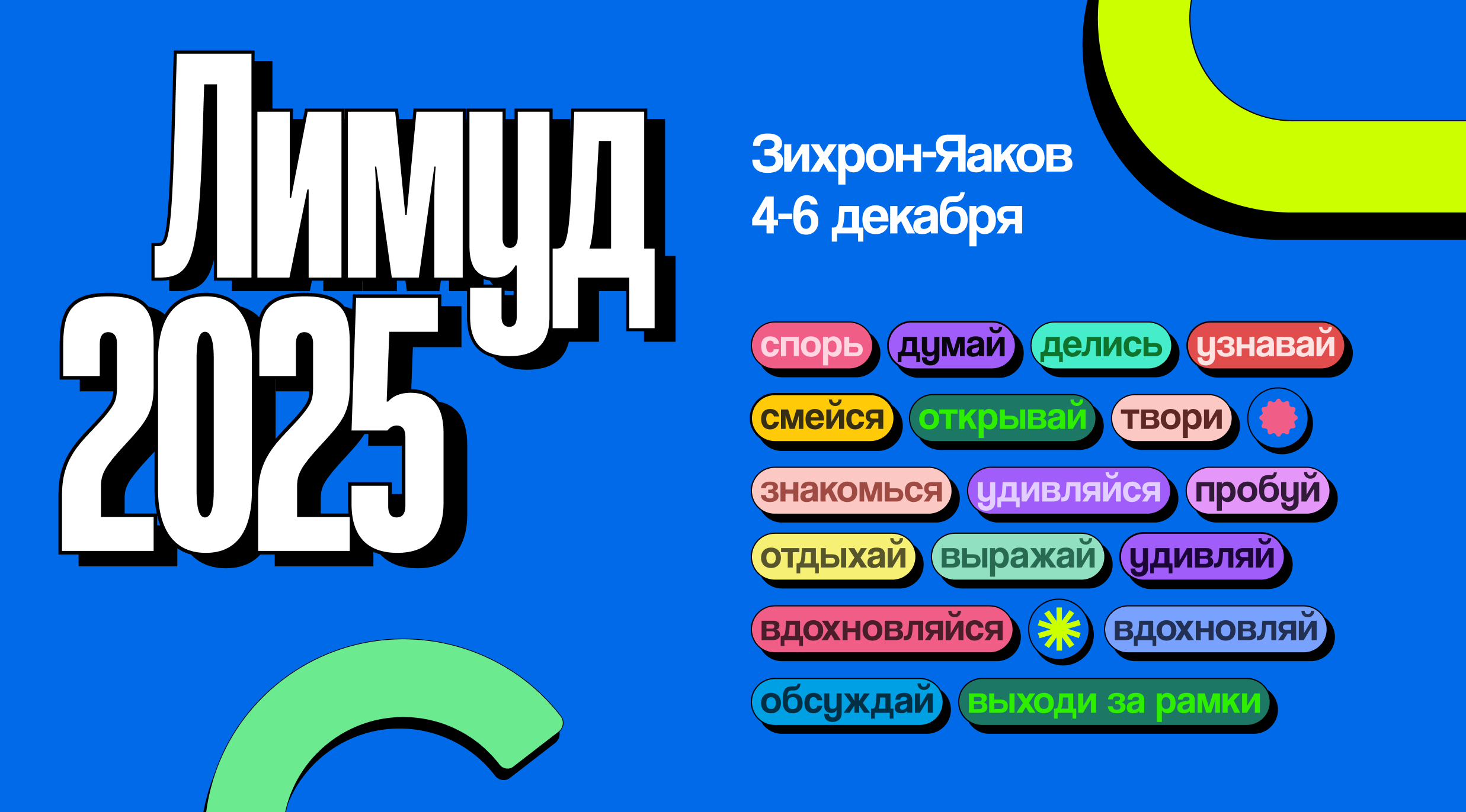
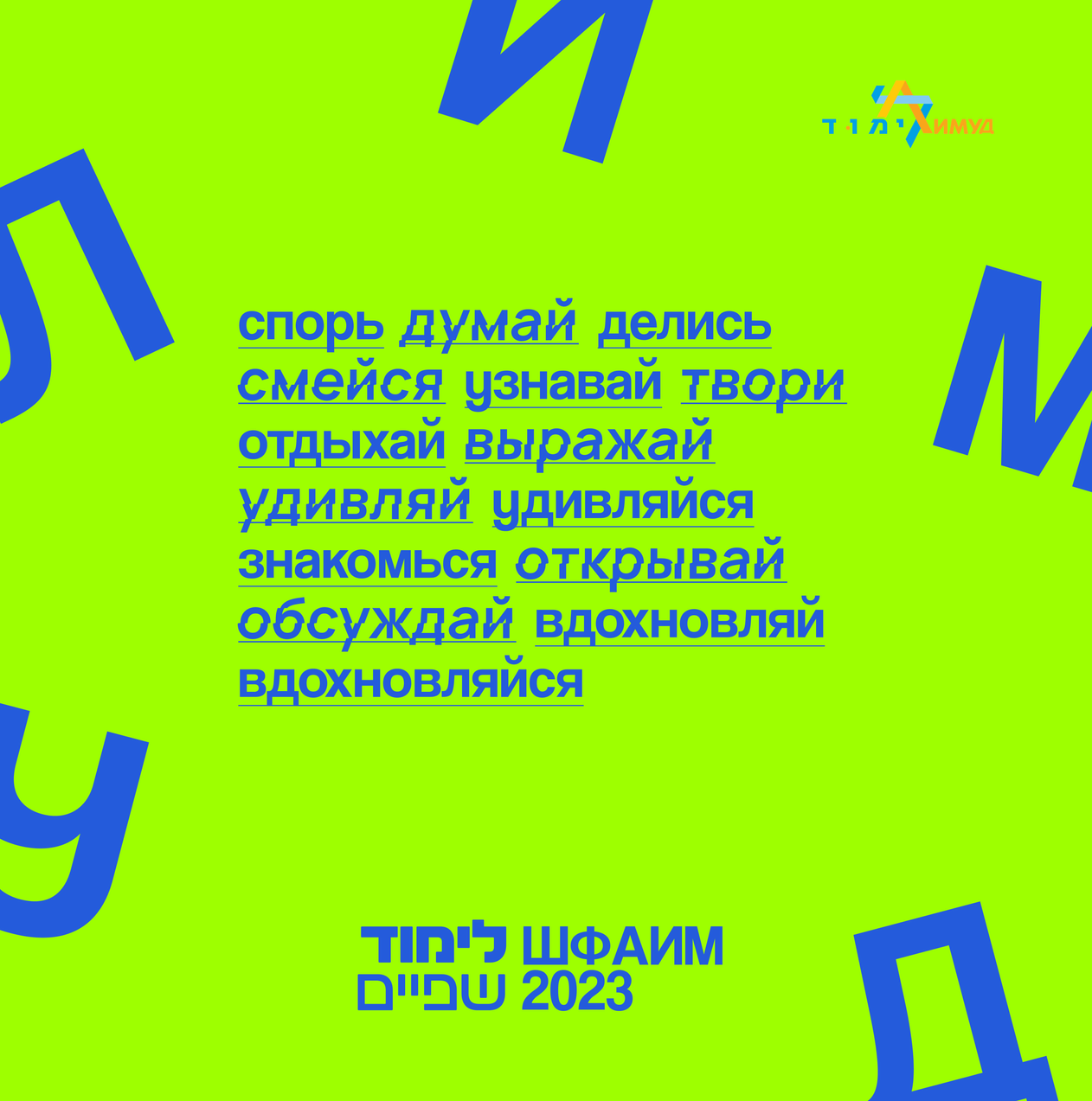
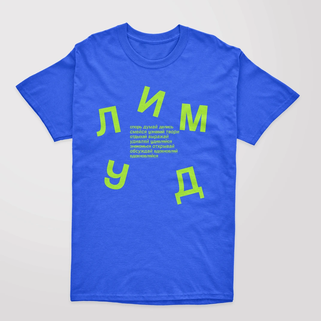
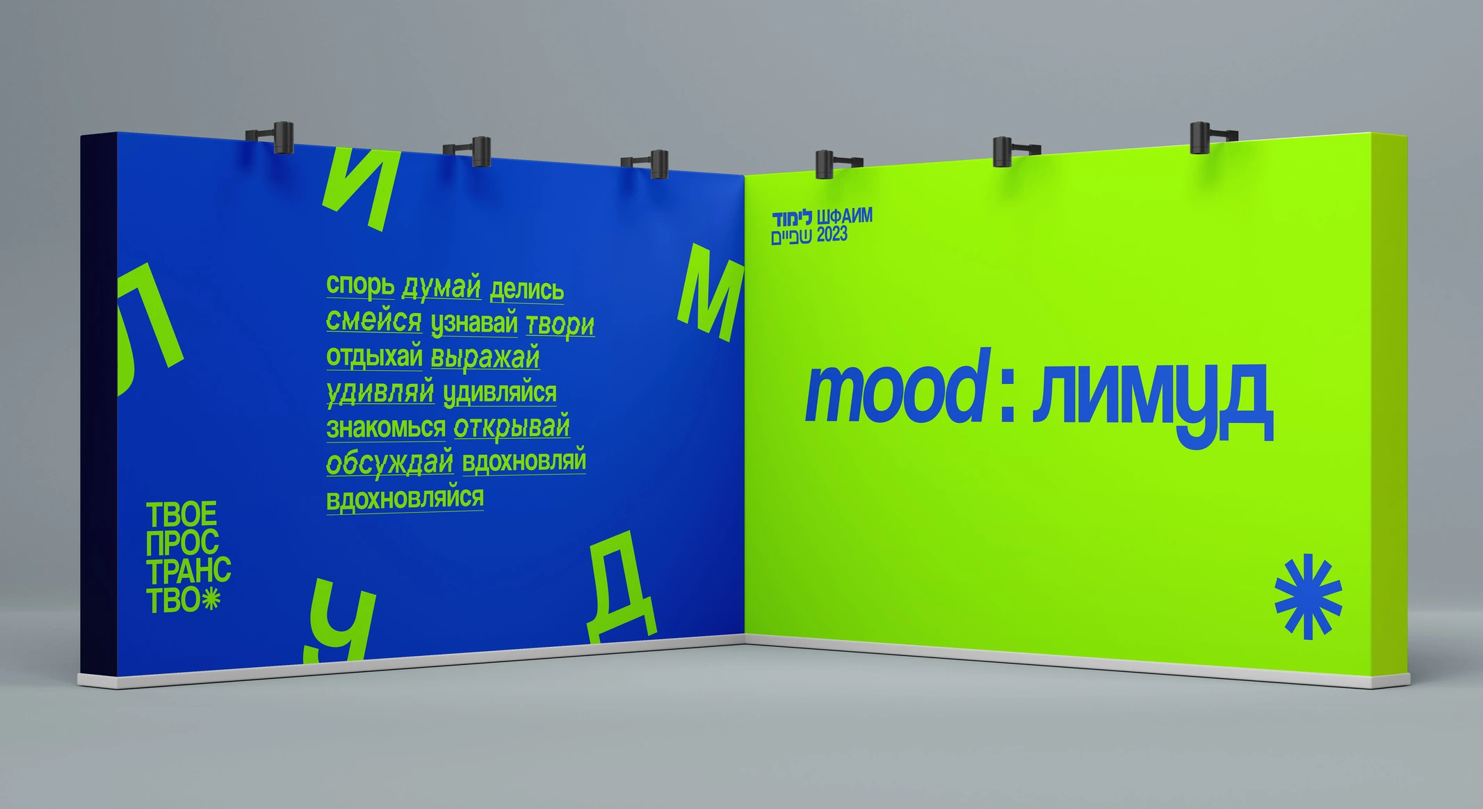
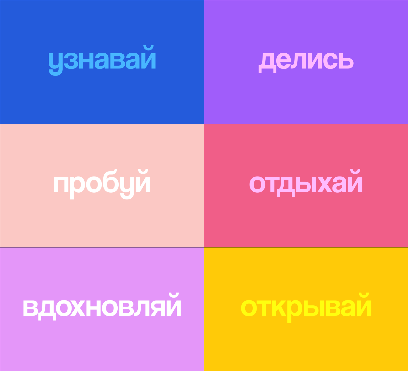
In the 2023 edition, we adopted a different approach in communicating with the audience. Moving beyond the straightforward message from 2022, we focused on evoking emotions and encouraging actions that Limmud can inspire, such as: learn, debate, create, dance, act, relax etc.
The primary focus is on prompting action, with everything else as secondary. We used colors and shapes to create a graphic language that feels both familiar from previous year and refreshingly new.

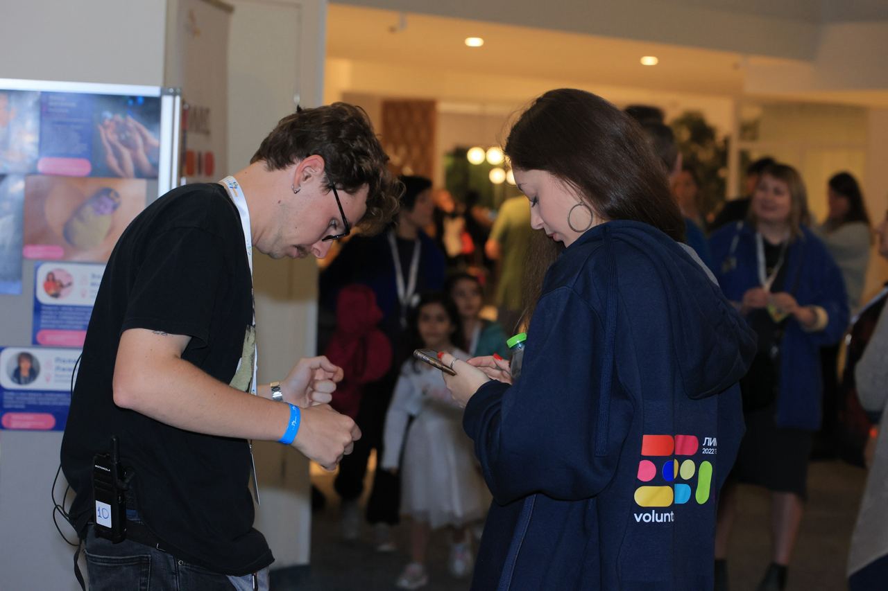
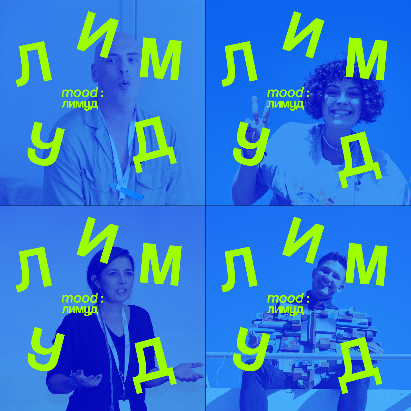
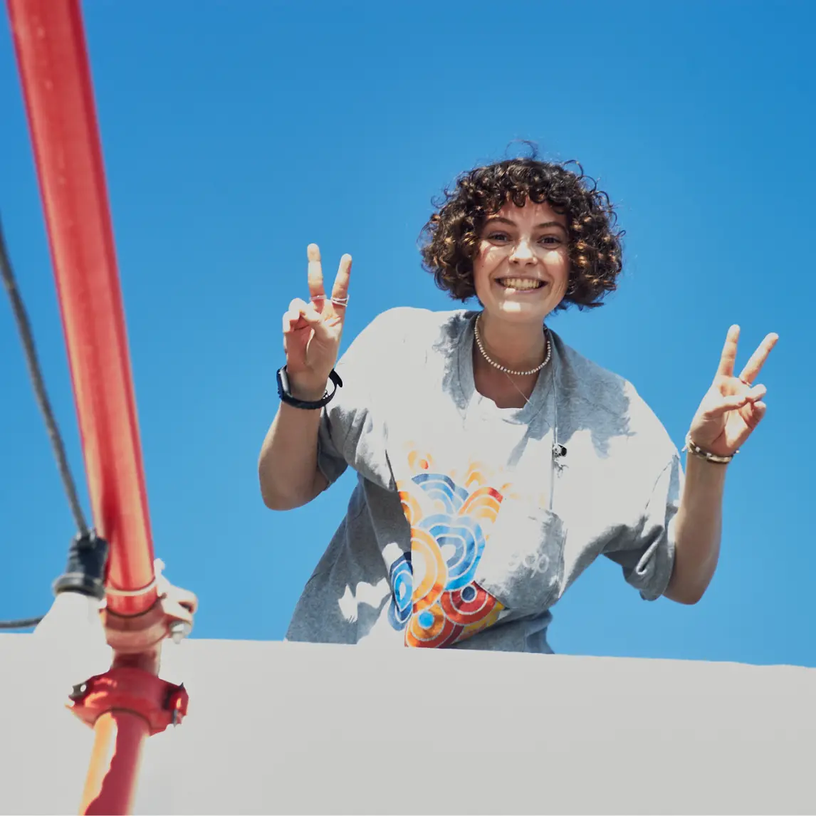
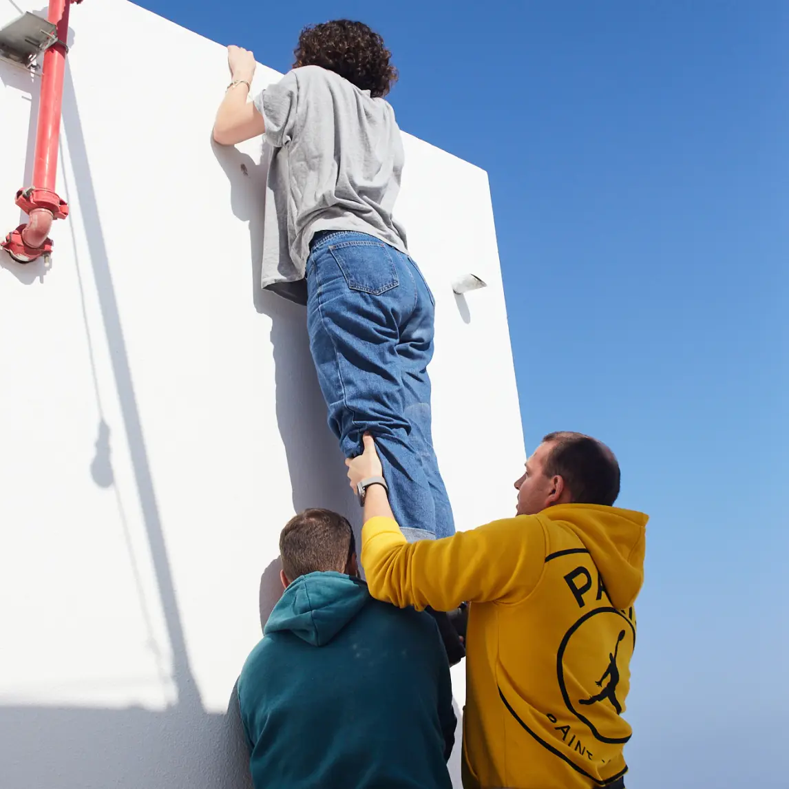
We also initiated shifting photographic style from monotonous images of auditoriums to more atmospheric, youthful, and even audacious photos and videos, reflecting the vivid vibe of the event.
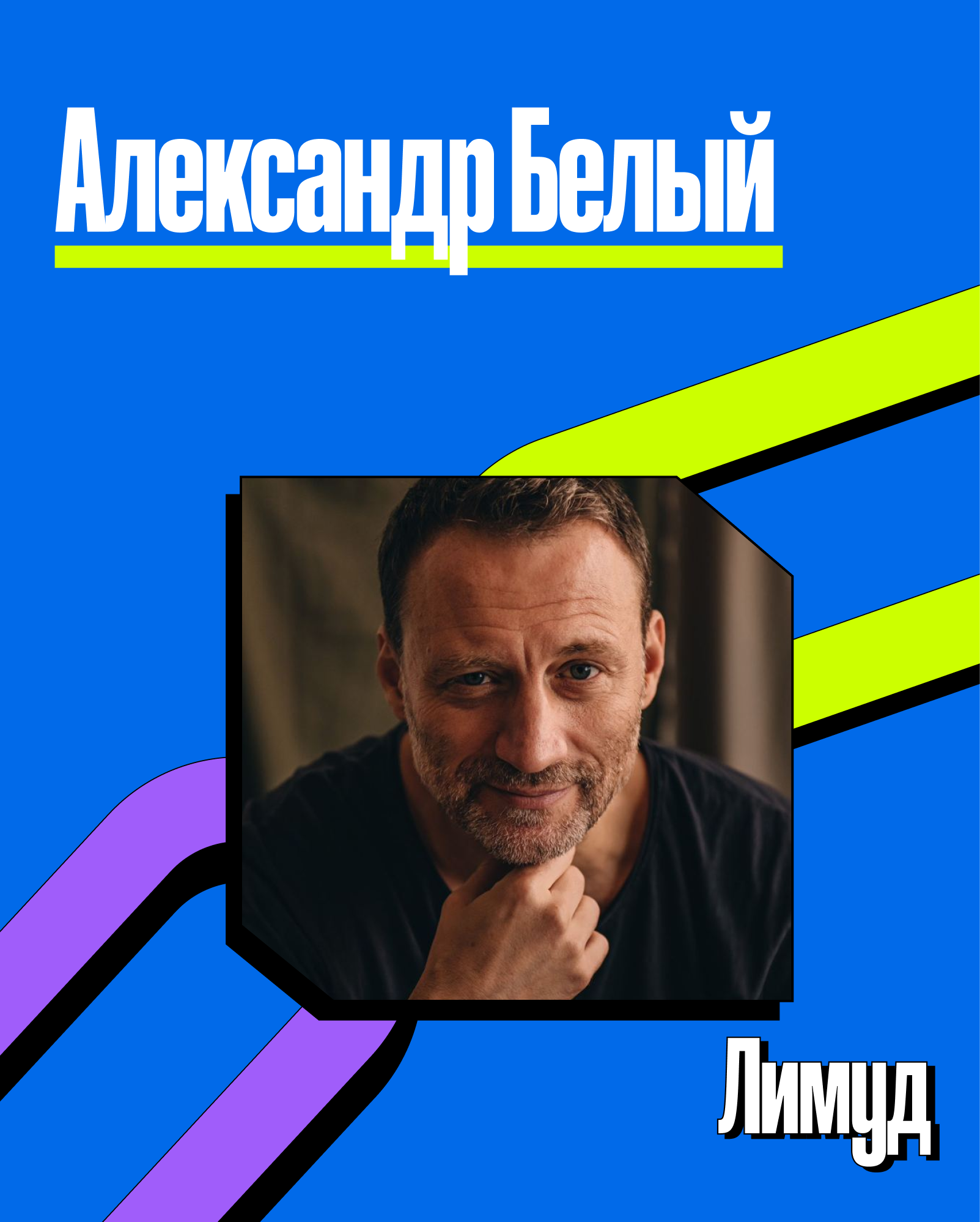
Ads & Social
other projects
