An international Jewish organization with multiple internal products needs to reorganize its website. The current site has become overly complex, difficult to navigate, and challenging to update with new content. Additionally, it is not effectively serving the primary goal of clearly explaining what the organization is and what it does.
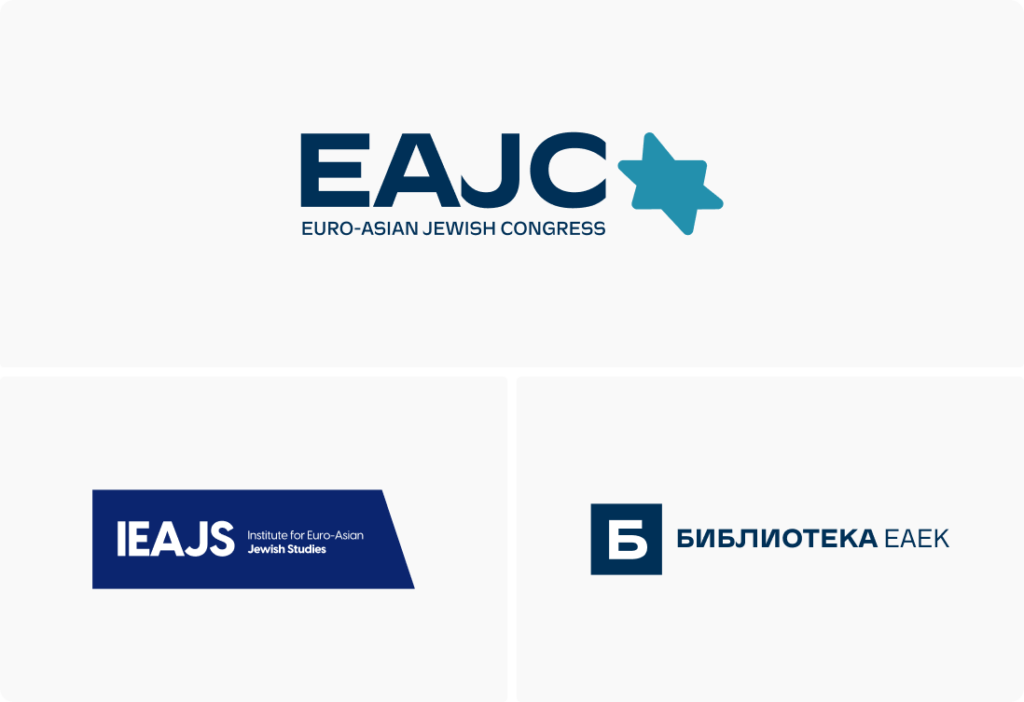
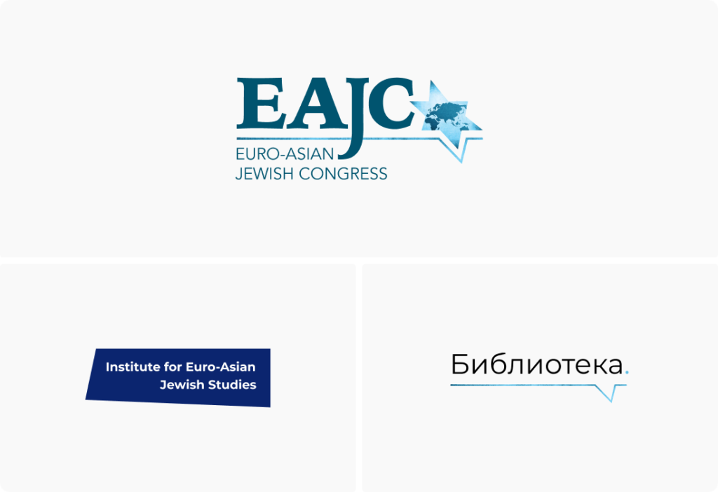
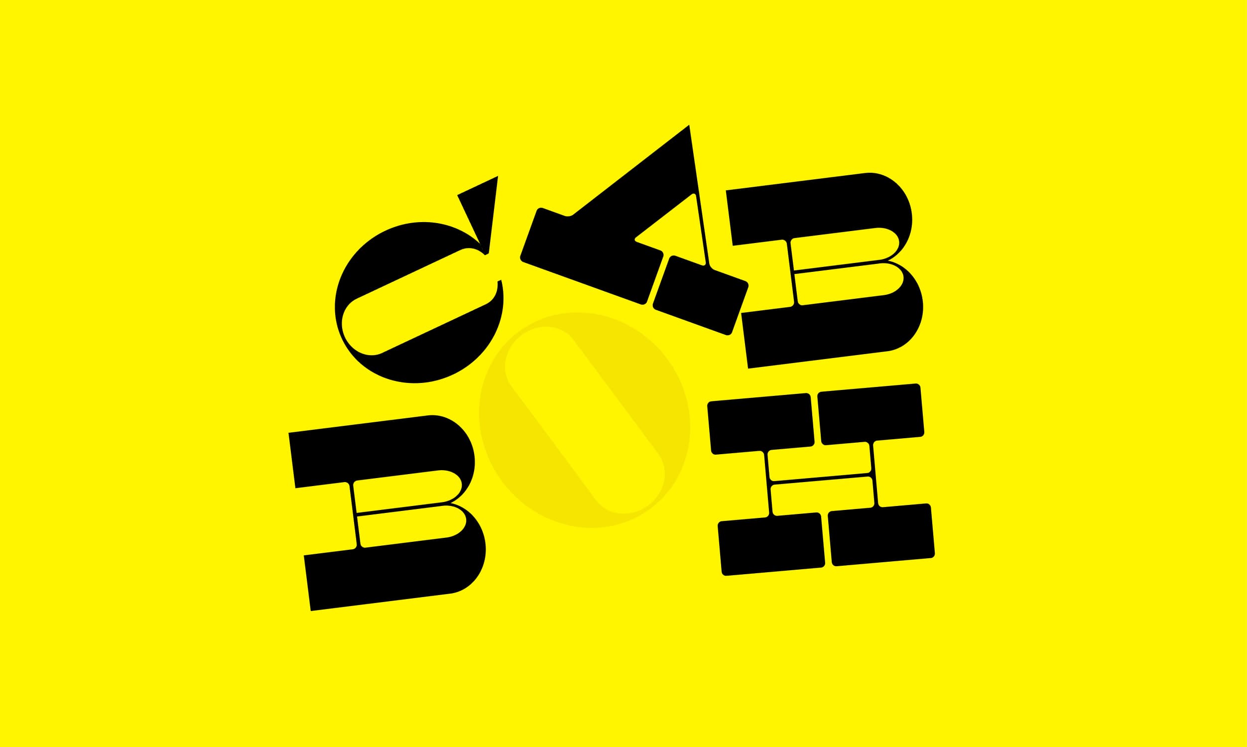
A brand audit revealed that the organization’s identity, including its logos, was somewhat outdated and did not reflect the image of a modern, dynamic, and impactful organization.
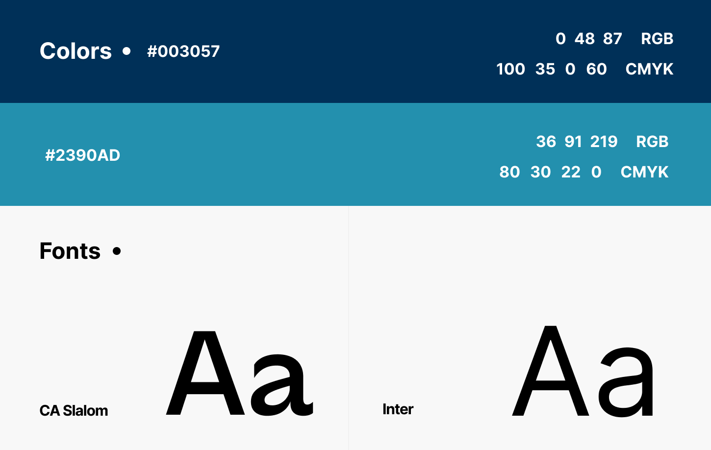
Additionally, its graphic language was inconsistent across different products. I redesigned the logos, established a unified graphic language, and helped formulate key messaging points for the brand.
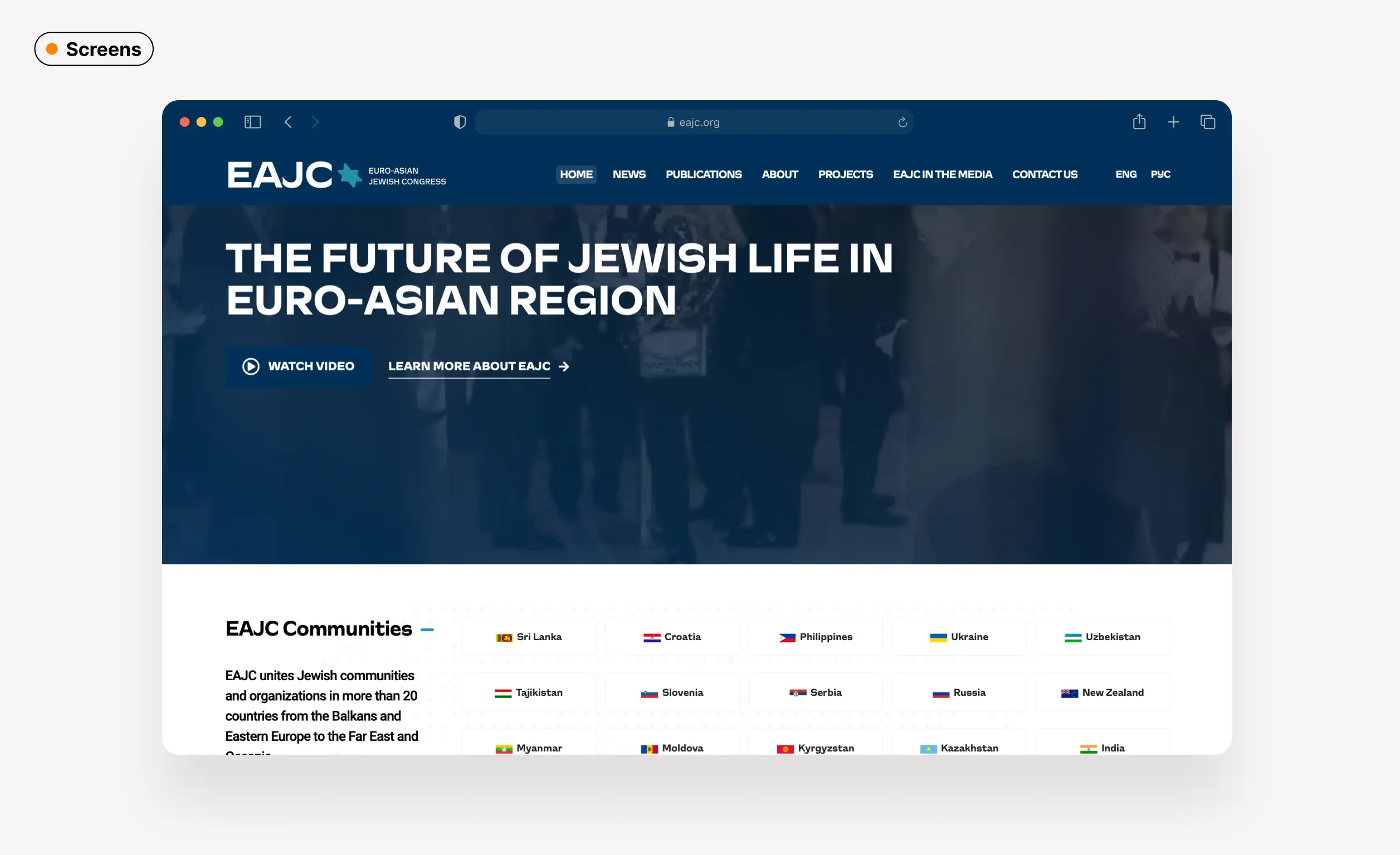
I introduced redesigned logos that preserved key original elements while becoming much cleaner and consistent, achieving a modern, professional look and moving away from the old-fashioned style.
We subtly updated the color scheme and used a combination of typefaces — more expressive for logos and titles, paired with a classic, minimalistic one for text.
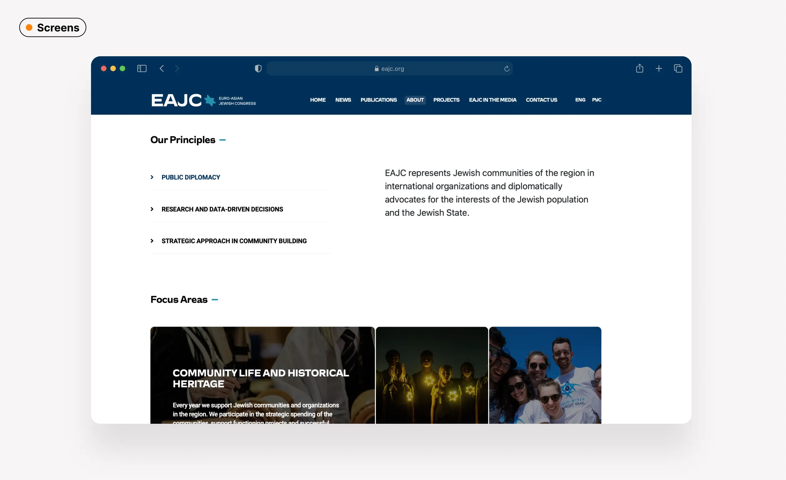
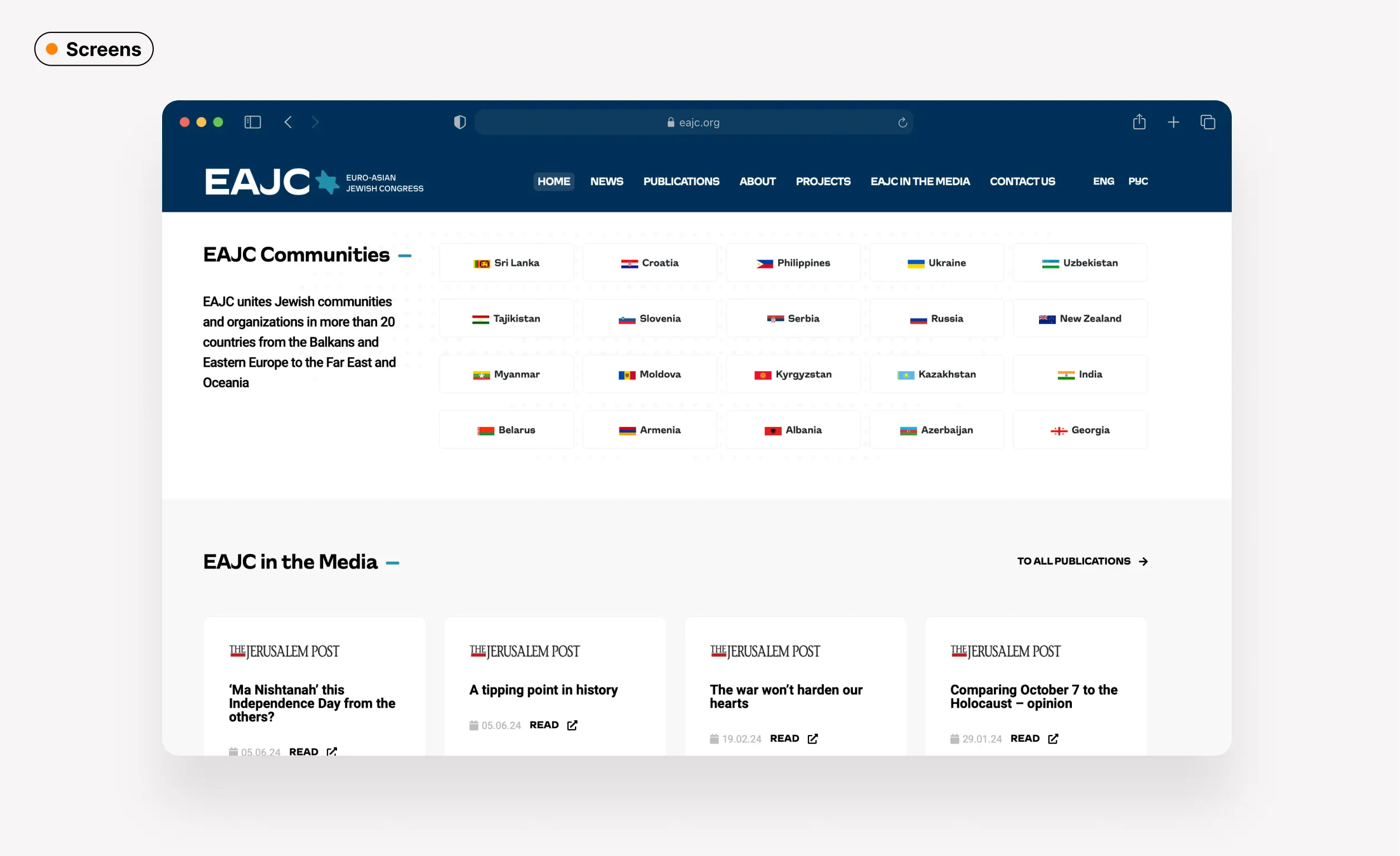
The new graphic language and approach were integrated across all products and implemented into the new website design, which not only simplified the user experience but also streamlined content management and enhanced the website's ability to effectively communicate the organization’s mission and activities.
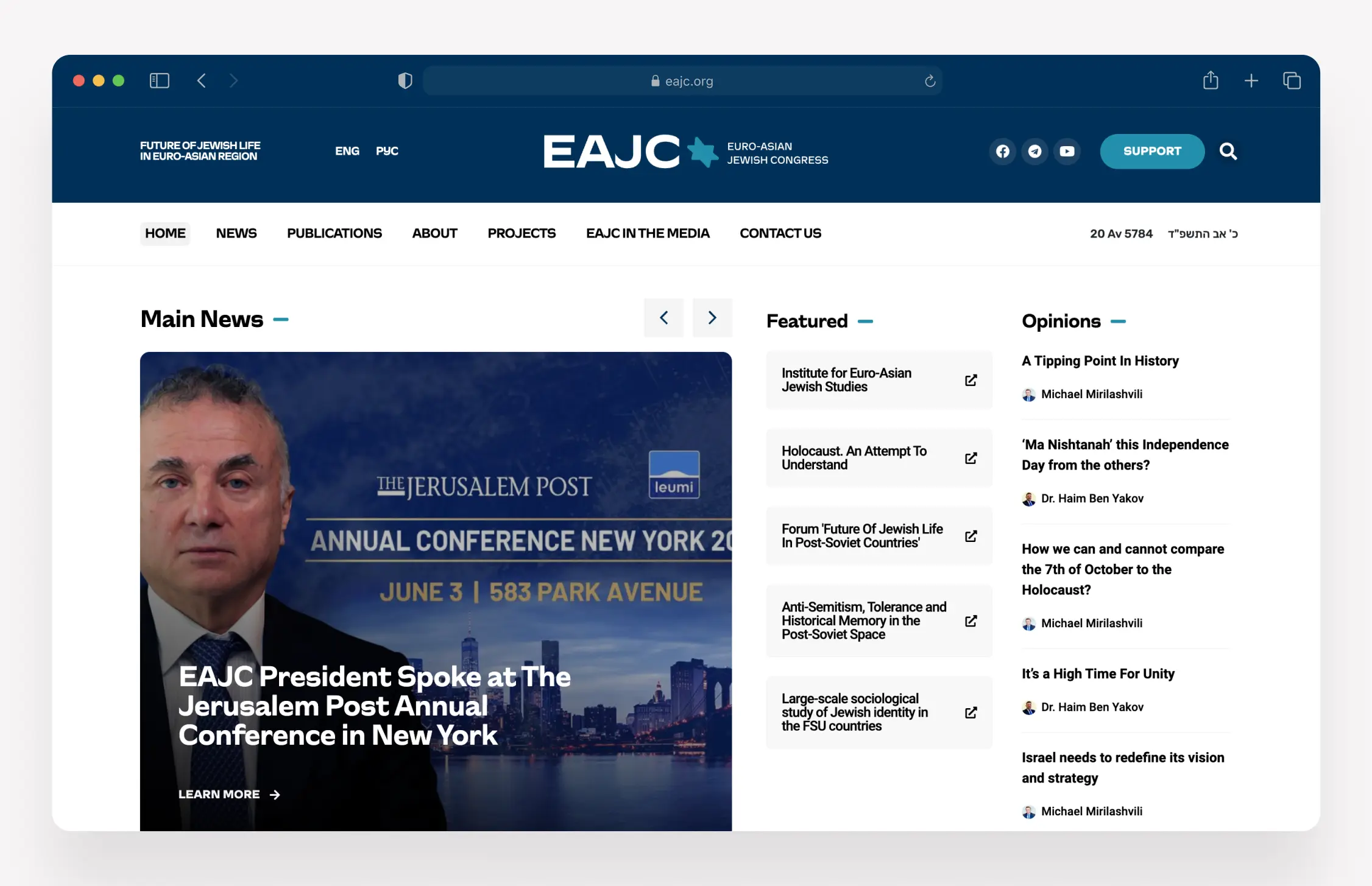
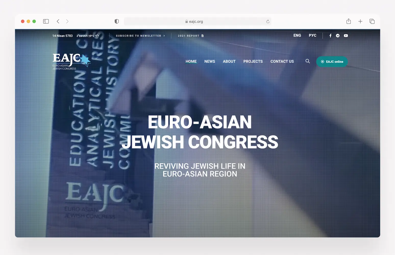
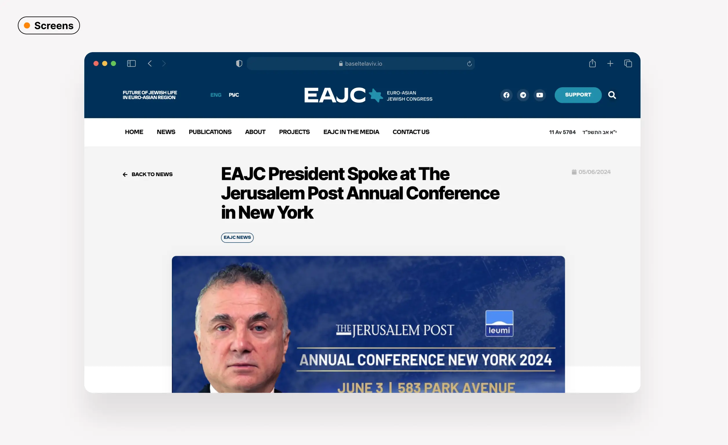
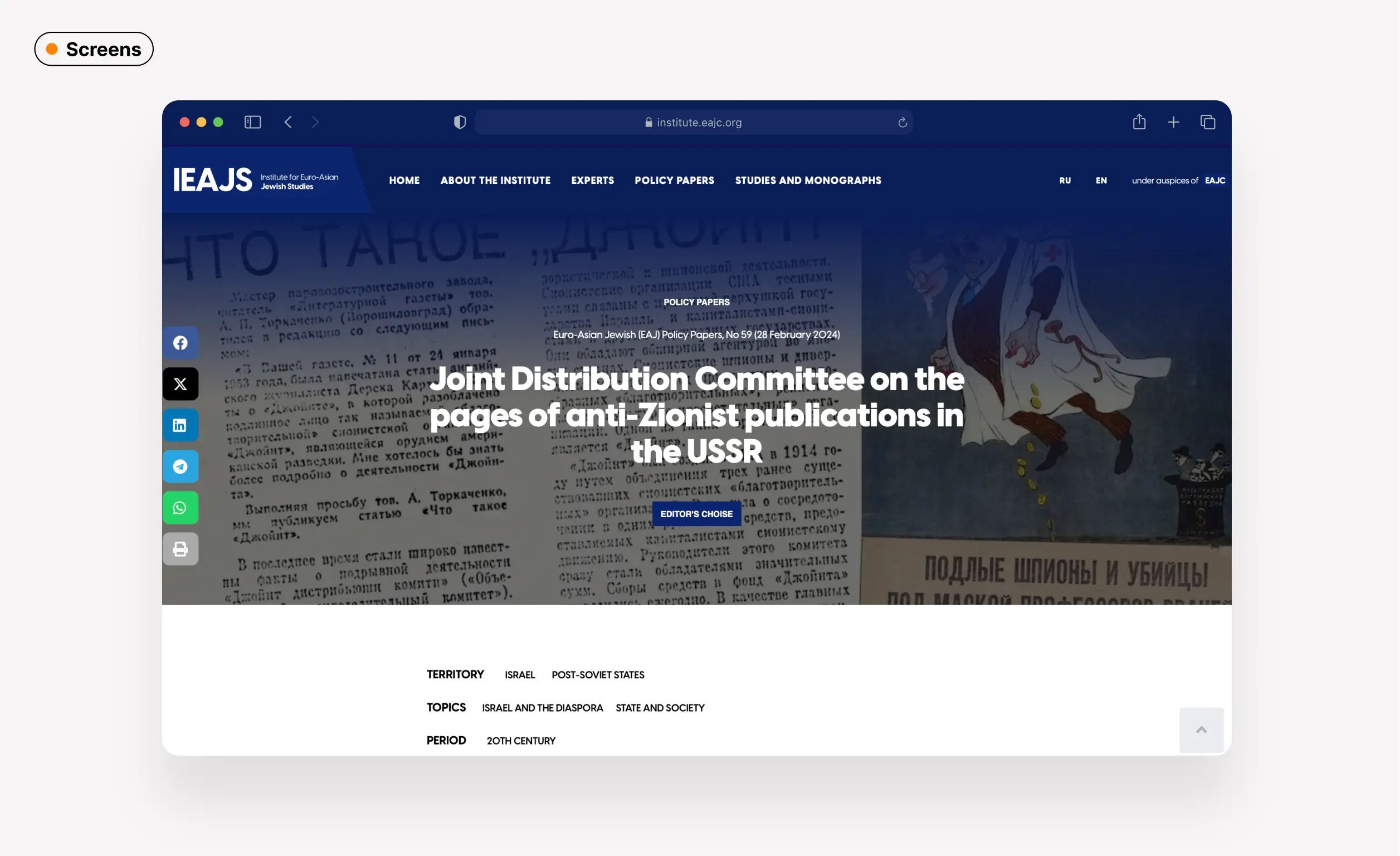
I replaced pretty templated first screen, which only displayed a slogan, with a dynamic, information-driven design. The new layout features a main news slider that highlights the organization’s latest developments. Featured projects are emphasizing the organization’s core activities. Additionally, op-eds from leaders provide insights into the organization’s focus areas and the expertise driving its initiatives.
This redesigned screen is dense with information yet structured and easy to scan, ensuring that visitors quickly grasp the organization’s mission and key activities.
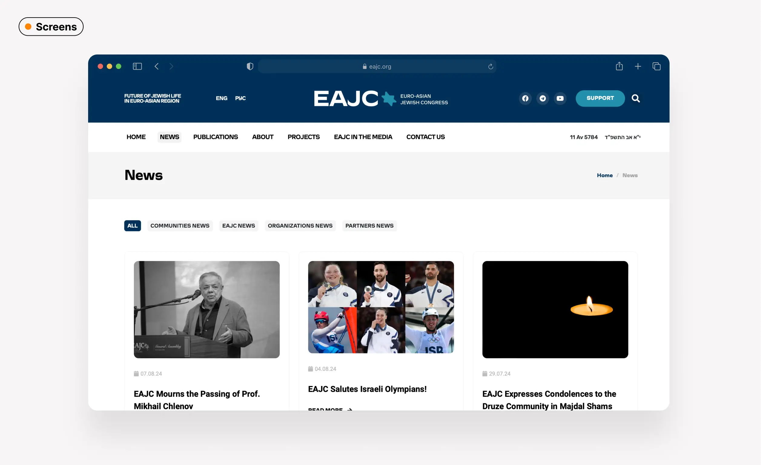
Overall, the previous website was overly stretched and prioritized certain visual choices over the clarity and value of the information.
We made both the main website and those of the side projects space-efficient, less cluttered, and easier to read and navigate.
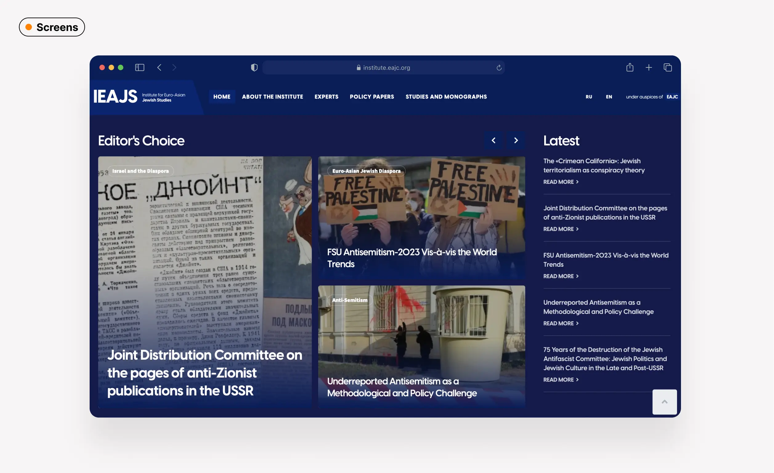
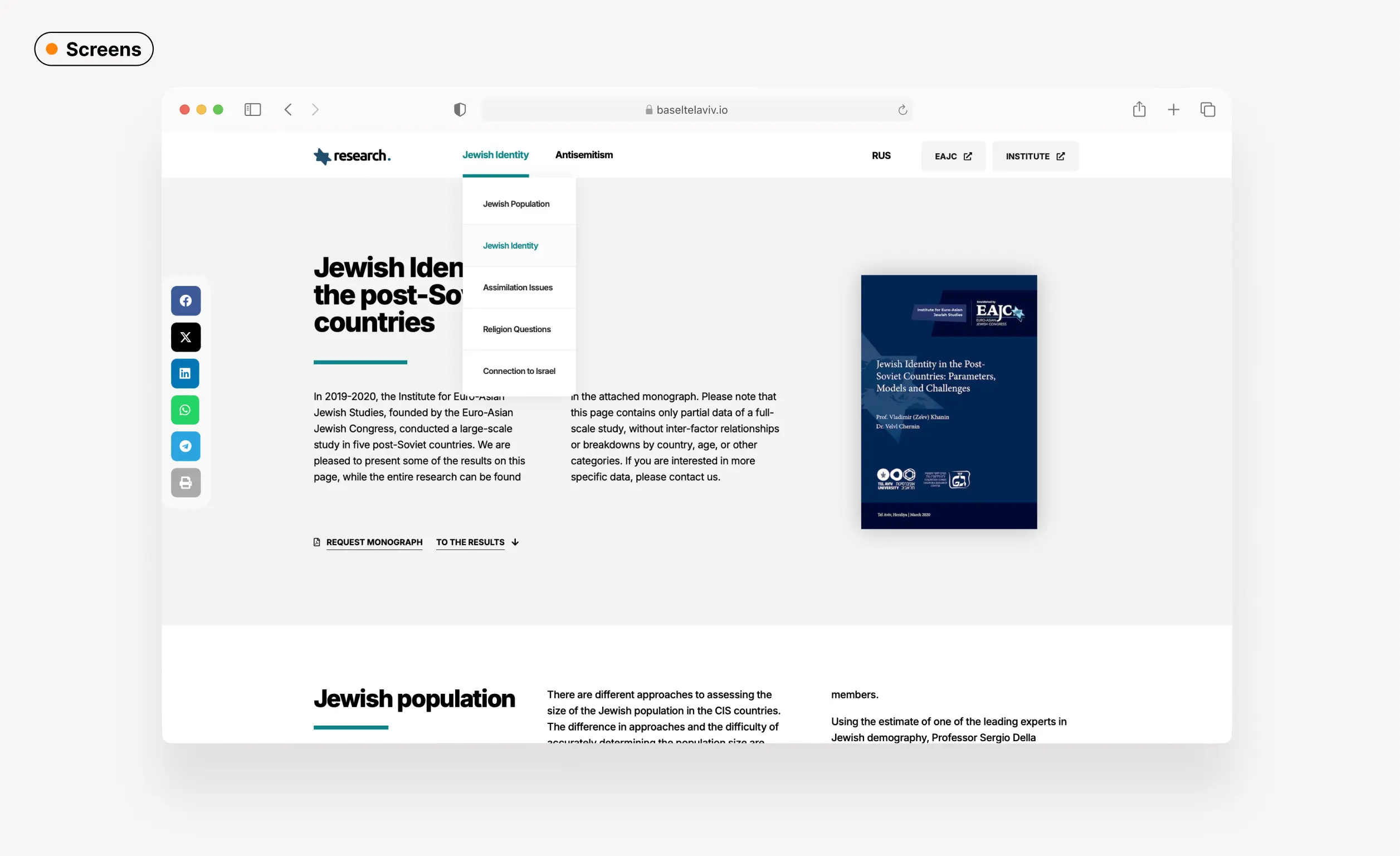
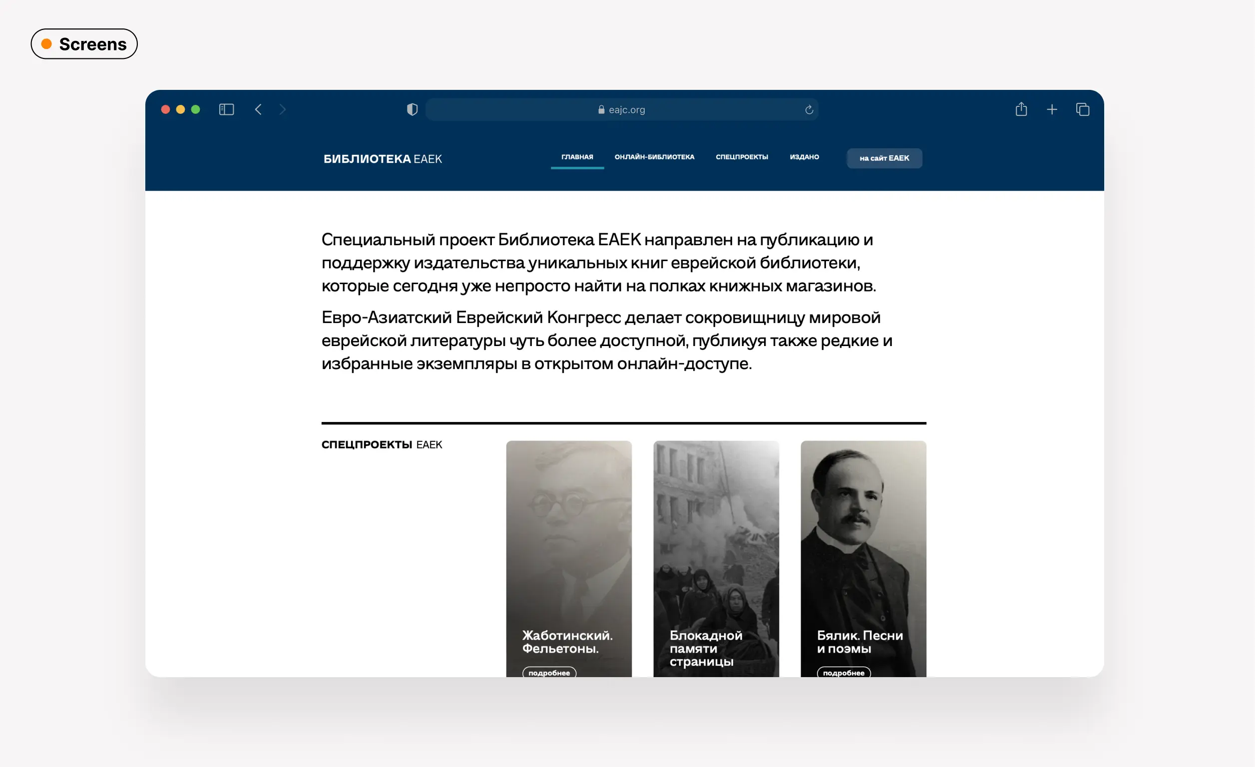
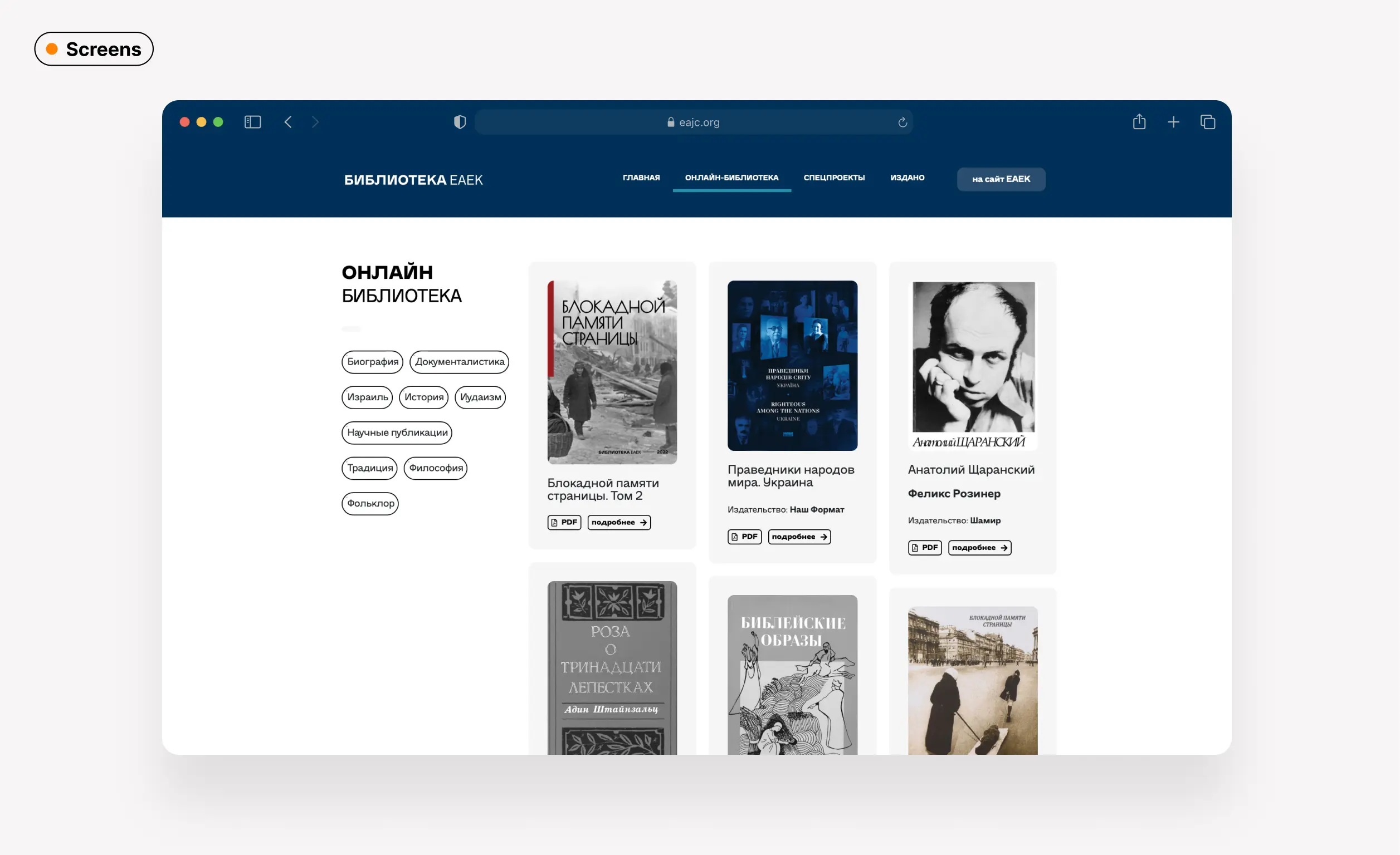
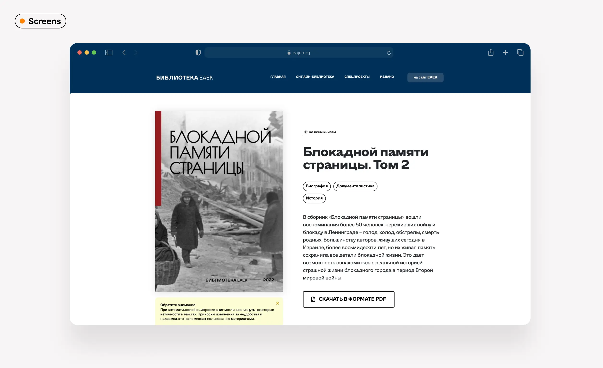
We also moved certain standalone projects, such as the e-library, out of the main website onto sub-domains.
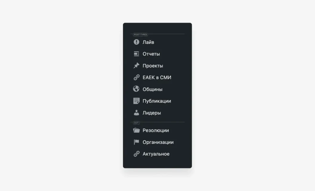
In addition, I developed a user-friendly content management system using no-code solutions by creating customized post types in WordPress, making it easy to update and manage content.
SocialandPrint
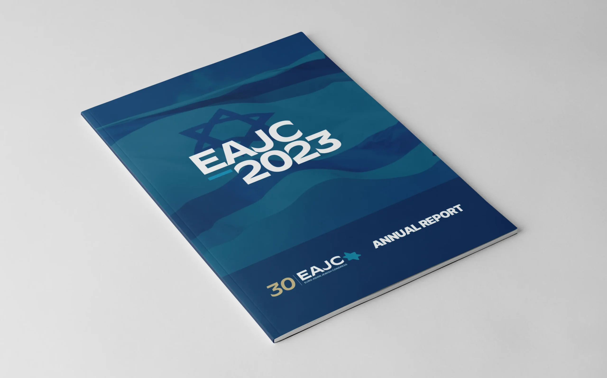
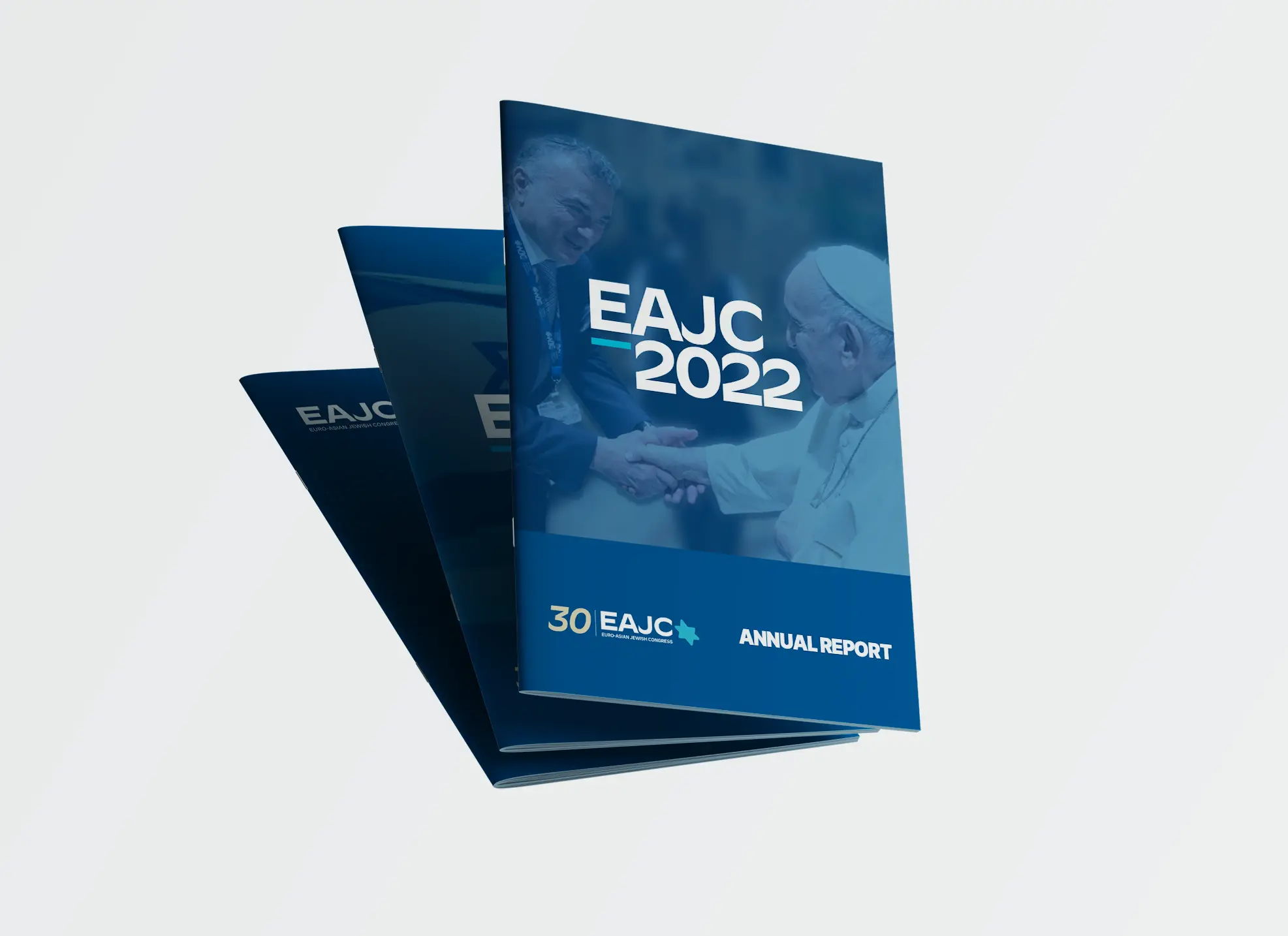
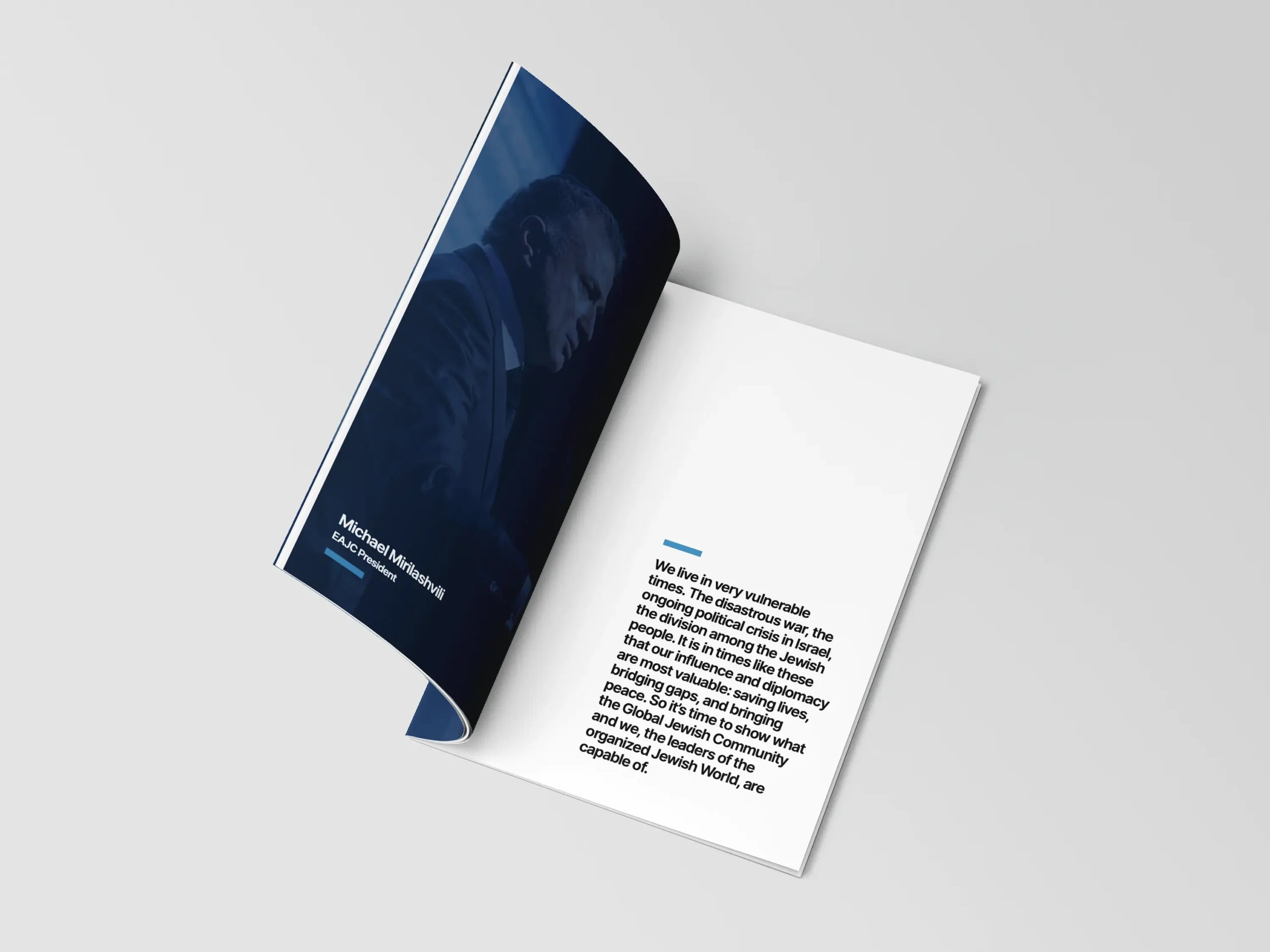
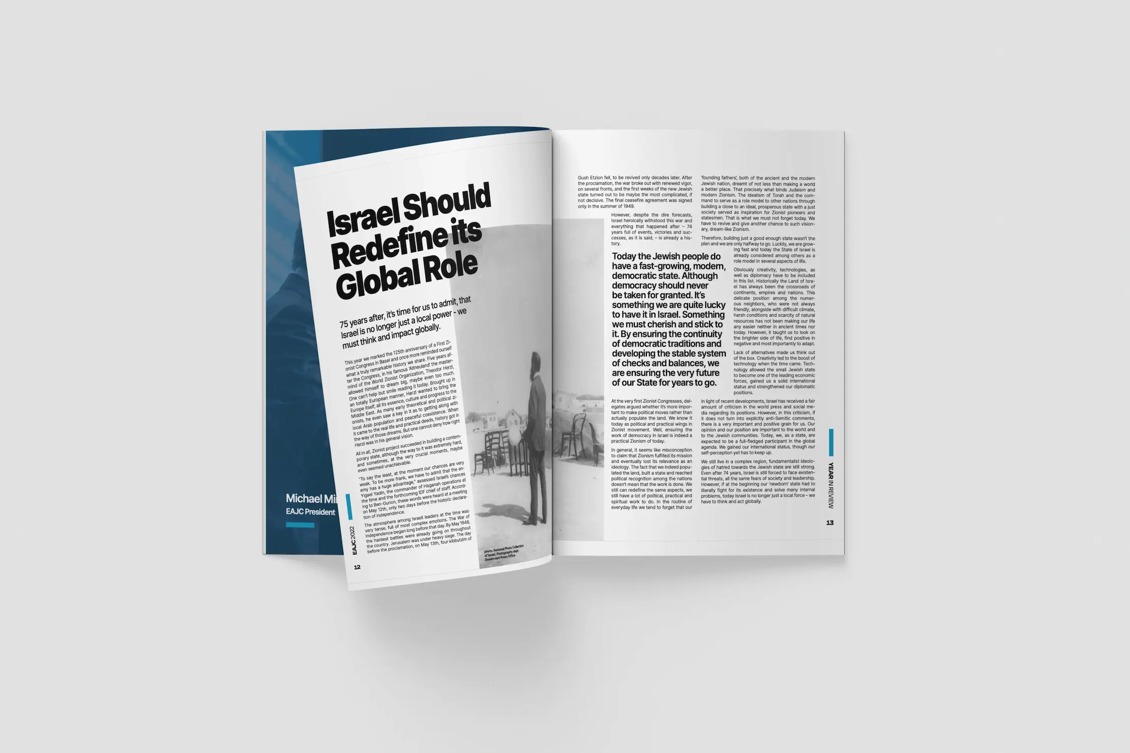
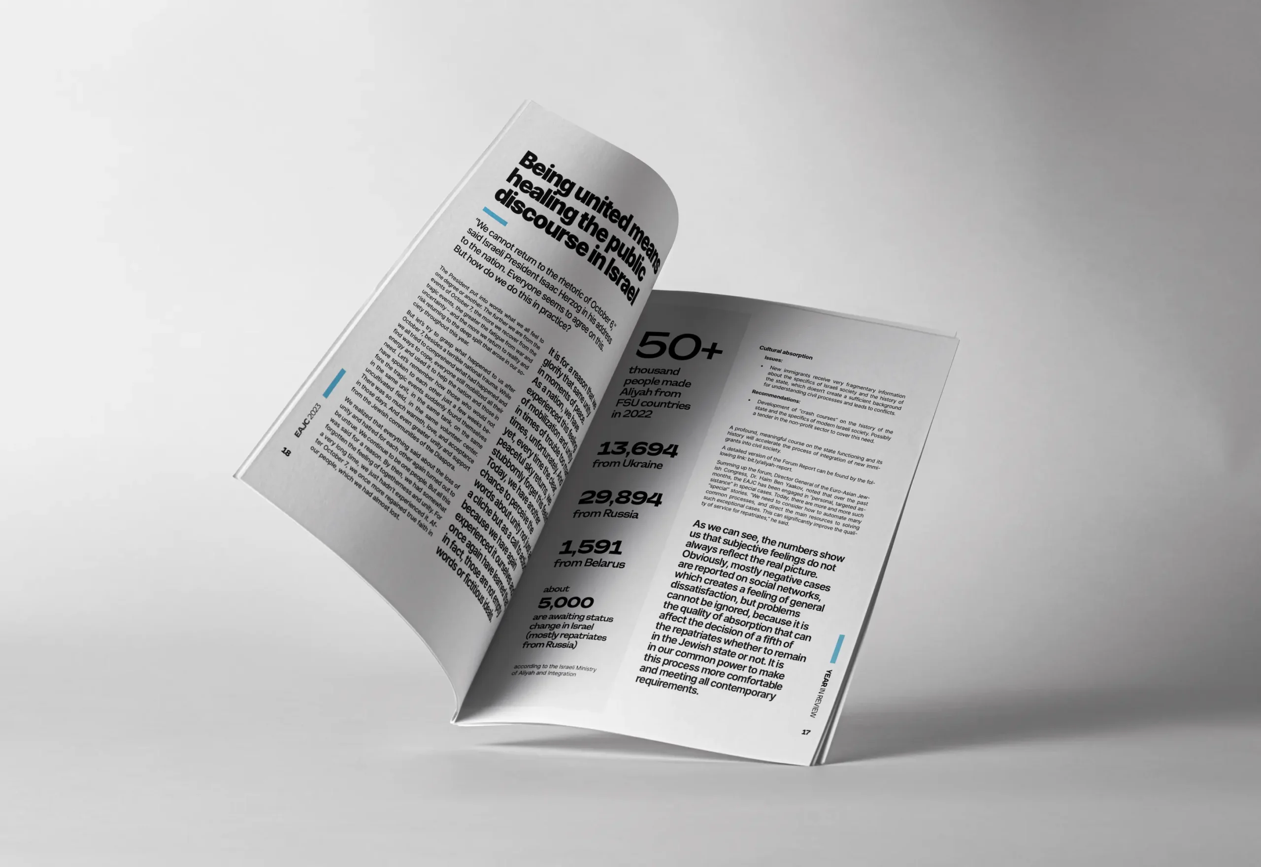
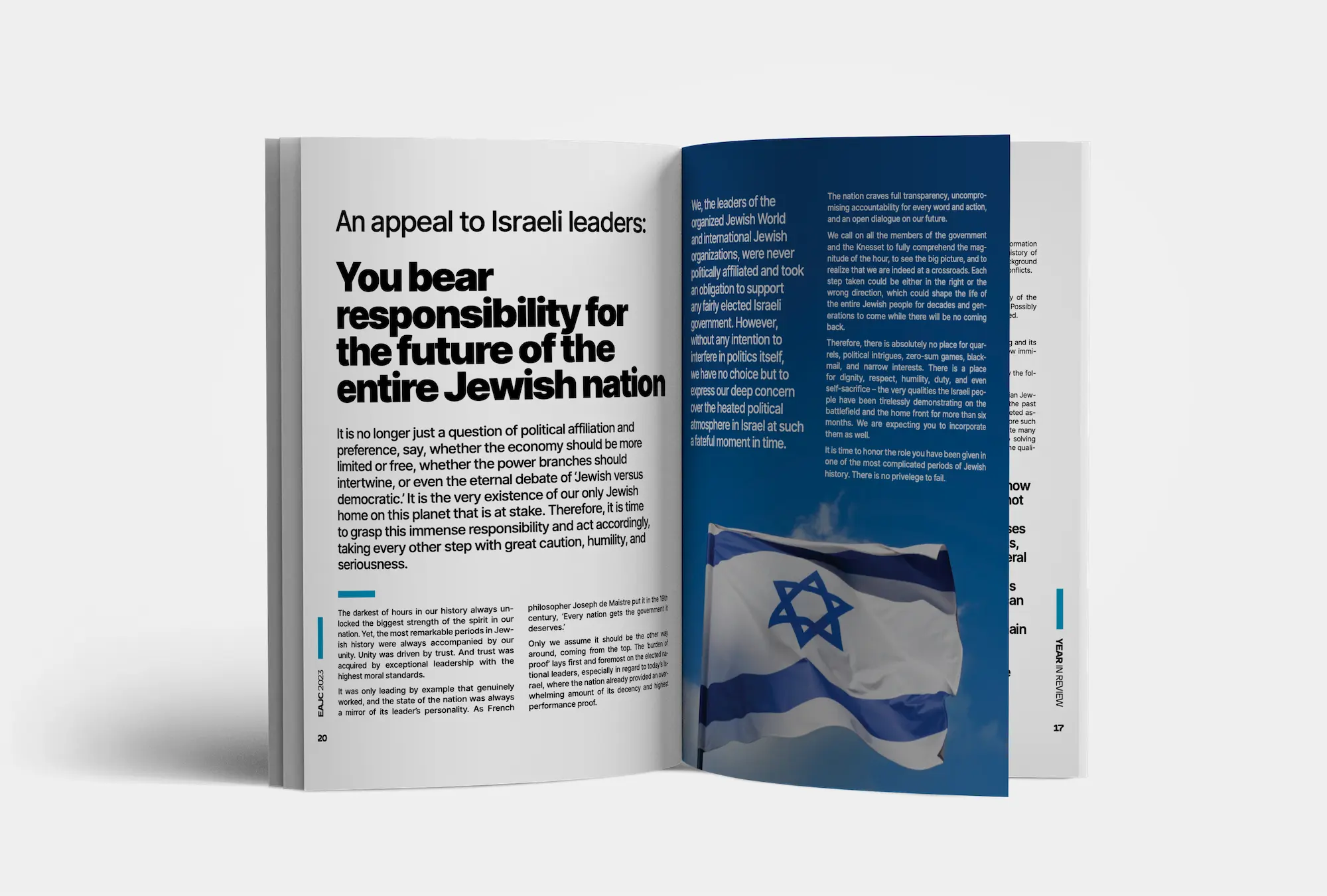
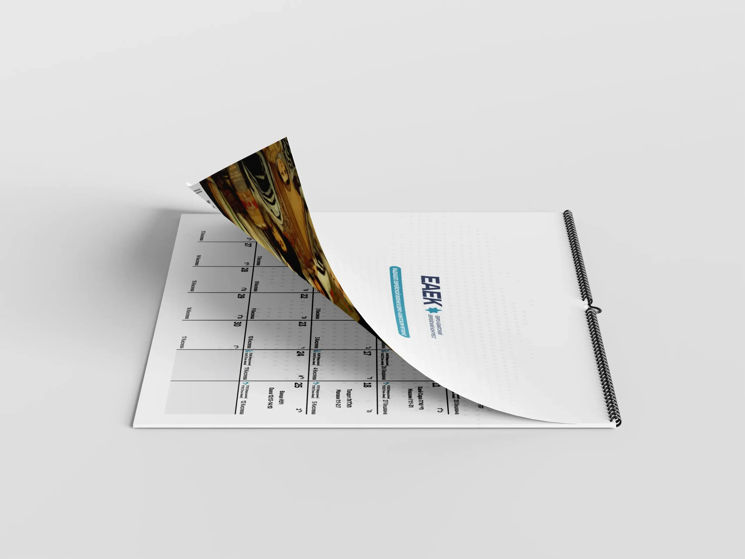
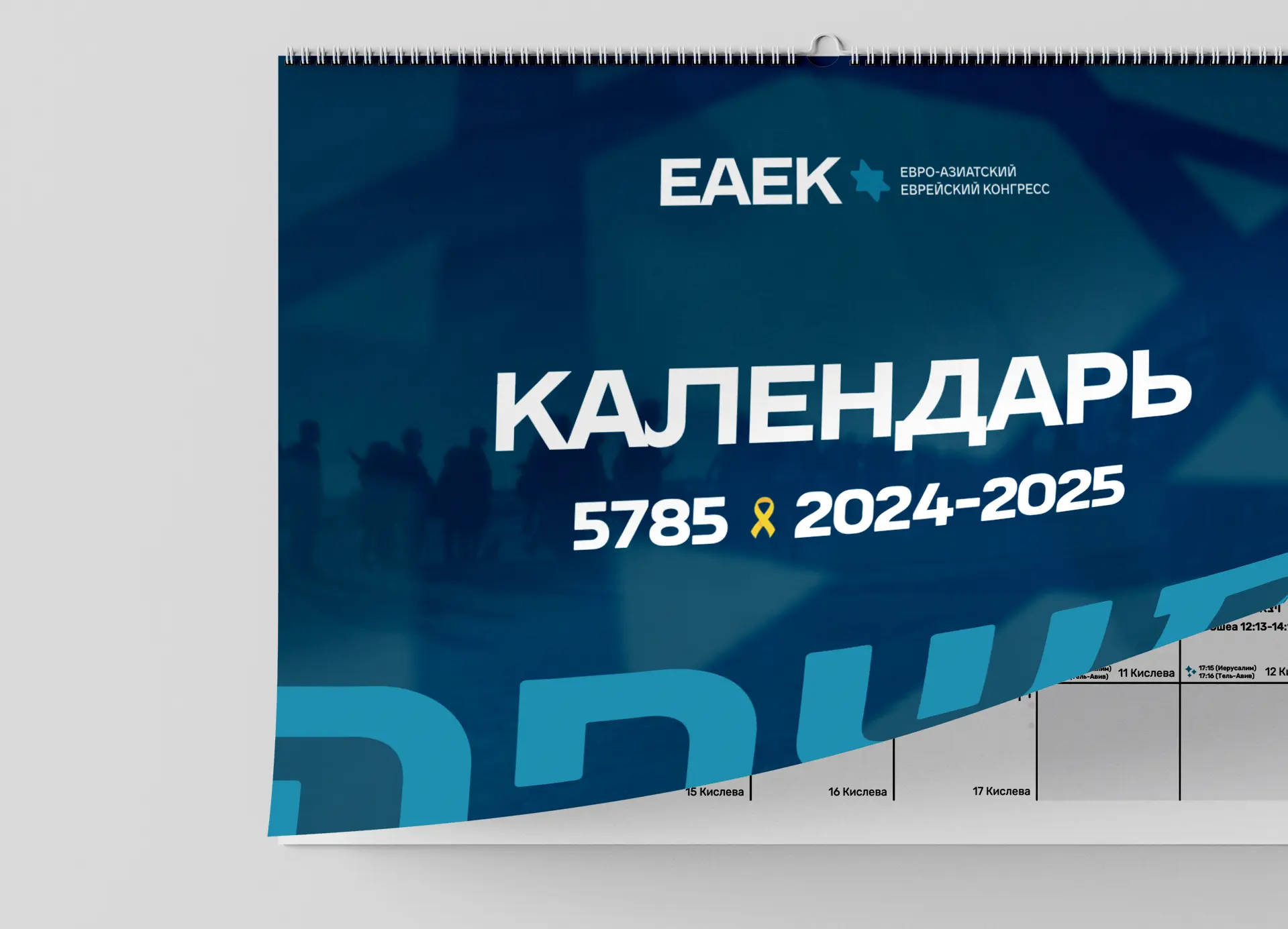
The graphic language and its elements were seamlessly integrated into both digital and print production, further enhancing consistency across the board. We also revisioned the annual reports, which had previously been quite dull, transforming them into a magazine-style format featuring articles, in-depth analysis, and op-eds.